Whether you’re using Photoshop to edit photographs, create digital artwork, or for any other purpose, it’s almost certain that colors are of ultimate importance. Knowing how to work with colors most effectively will really elevate your work.
But what happens when the colors just don’t seem to be looking quite right no matter how much tweaking you’re doing in Photoshop? Well, color profiles might be part of the issue. Working in the wrong color profile or converting between color modes can sometimes lead to strange outcomes.
Luckily, sometimes all it takes to solve all your color-related problems is simply switching between profiles by selecting Image > Mode > (Relevant Profile Name) from the top of the screen.
In this article, we’ll look more in depth at how this can be done in addition to how you can avoid having such problems by setting the color profile correctly when initially creating a document. If you’re having more extreme issues with Photoshop’s color display and all your documents are being shown in grayscale, then check out our article on what to do.
Table of Contents
What Are Color Profiles?
Before we go ahead and discuss how to switch between color profiles, let’s first establish what color profiles actually are. Essentially, color profiles are numerical sets of data that exist in spaces to standardise the appearance of colors across single documents or whole devices. They aim to manage this in a way that lets colors appear the same to all viewers on all devices, but some achieve this better than others. Some data sets, such as that used in the RGB mode, are very large, whereas others, like Bitmap, use just two colors to manipulate the appearance of different pixels.
In the same way that different document sizes or resolutions are most suitable for certain situations, the best color profile for your document depends largely on the purpose of your design. The most common modes are RGB and CMYK.
Why Are Color Profiles Important?
Whilst it may seem like a small setting, the color mode of your document is important as it determines how the pixels in your image will appear. Choosing the wrong color profile might mean that your work will look different when printed or exported in a different format. You can read more about this in our article about why Photoshop sometimes changes your color profile and the impact that this can have.
What Are the Different Color Profiles in Photoshop?
Photoshop allows its users to work in six main color profiles: RGB, CMYK, Lab Color, Grayscale, Indexed Color, and Bitmap.
RGB is one of the most commonly used color modes. Standardising colors around red, green, and blue, it can assign millions of different colors to the pixels in an image. It is the color space used for most digital displays, such as television and computer screens. For this reason, you should opt to use this profile when working on documents that will be presented digitally rather than printed.
CMYK Color is another popular mode, which operates around cyan, magenta, yellow, and black. These are the colors of the inks used in printing, so CMYK is the better choice for projects that will be printed out, such as business cards, posters, and merchandise.
Lab Color uses a triple-axis system to standardise the colors in a document. The three axes are L (lightness), the a-axis (measuring colors on a spectrum between green and red), and the b-axis (operating based on the range of colors between blue and yellow). It is often said to be the color mode that works most similarly to the human eye and is used for printing logos onto products and textiles due to its excellent ability at cross-device color standardisation.
The Grayscale mode causes pixels to adopt tones ranging from black to white, resulting in pixels that take on a wide range of gray tones. In contrast, the Bitmap mode assigns either black or white to every pixel rather than a spectrum of tones in between the two extremes, creating quite a unique visual outcome.
The last mode we’ll look at is called Indexed Color. It assigns one of up to 256 colors to the pixels in an image, making it more limited yet still capable of preserving an acceptable color quality. We would advise against working in this color space as it results in a restricted range of editing capabilities but converting your documents to this profile once you’ve finished making edits is a great way to reduce the file size.
How to Set the Color Profile When Creating a Photoshop Document
The best way to avoid encountering any color-related issues during the editing process is to set the color profile correctly in the first place. Luckily, this can be done very quickly in the New Document Window.
To create a new document as usual, open Photoshop and head along the top of the screen to File > New. Alternatively, you can hit Ctrl + N [Win] / Cmd + N [Mac].

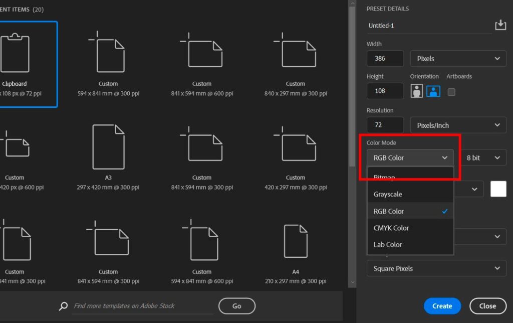
In the window that opens up, you should notice that there is a dropdown menu labelled Color Mode, as highlighted below. Click on the arrow within this box, then choose the relevant color mode from the list that pops up as a result. If you are unsure of which profile to select, try rereading the section above. A basic rule to follow is that RGB should be used for work with a digital final destination, whereas CMYK should be used when working on anything that will be printed.

Feel free to change any other settings in the box to set the other properties of the document, then hit Create to launch the new document!
How to Change the Color Profile of an Existing Document
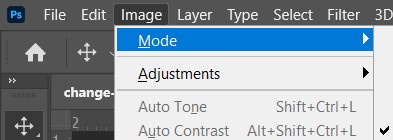
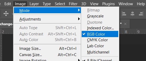
To change the color profile of a document that you’ve already been working on, start by simply selecting Image > Mode from the bar along the top of the screen.

Doing so should cause a list of color modes to fly out from the menu, from which you can go ahead and click on whichever color profile you would like to work with!

And that’s pretty much all there is to it! You can switch between color profiles at any time when working in Photoshop, but keep in mind that to avoid any problems with color display it’s usually best to set it correctly from the beginning.
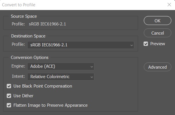
As a final note, if the colors within your documents always look slightly different in the exported JPEG to how they appear when you’re working in the PSD version, then the destination space might not match up with the document space.

A simple solution is to choose Edit > Convert to Profile from the top of the screen, before selecting sRGB IEC61966-2.1 from the dropdown menu titled Profile in the Destination section. For a deeper explanation of color spaces, feel free to check out this video by PHLEARN.
Hey, I'm a Professional Retoucher making $10k a month thanks to Photoshop.Register to my newsletter to get freelancing tips and a FREE Brush Pack in Bonus! My Newsletter


