Are you a Photoshop beginner, desperate to learn more about the program and its capabilities? Are you ready to learn how to make awesome pieces and start developing your design skills? Then you’ve come to the right place!
We compiled this Photoshop Beginners Guide into one big pdf that you can download for free here:

Here at LP Club, we understand how overwhelming Photoshop can be when you first open it: there are so many tools, windows, options, and aspects that you’ve never heard of.
We’ve all been there. But you’ll be glad to know that with this abundance of tools comes an abundance of possibility, as with its seemingly limitless capabilities, Photoshop really allows you to create anything you can dream of.
Developed by American brothers Thomas and John Knoll in 1987, Photoshop was created to be a simple platform with which photos could be edited. It was mainly used, at first, for clearing up scans of film and printed material, but has now developed to be used for a wide variety of tasks, ranging from sharpening an image to producing entire landscapes by ‘painting’ them digitally.
But, despite what you may think, no matter what task you’re using it for, Photoshop truly doesn’t have to be hard to learn. With a positive attitude and determination, you’ll be well on your way to becoming a Photoshop pro if you’re willing to put in the time to practice!
And, luckily, we’ve created the following article to act as a reference point during your Photoshop learning journey. We’ll cover all the basic knowledge you’ll need in order to understand the workings of the program, and we’ll even include some mini-tutorials on the most commonly used processes!
Table of Contents
- Why Should You Learn Adobe Photoshop?
- How Should You Learn Adobe Photoshop?
- Understanding Photoshop’s Workspace
- Importing and Exporting files in Photoshop
- Photoshop Tools and Must Know Techniques
- Working with Layers
- Guide to Image Adjustments
- Processes For Which Photoshop is Commonly Used
- Keyboard Shortcuts and Working Efficiently
Why Should You Learn Adobe Photoshop?
To begin with, let’s discuss the benefits of learning Photoshop. Especially for those with professions involving design or any form of visual communication, knowledge of Photoshop is just completely invaluable.
Any designer will agree that Photoshop gives flexibility and breadth of options, combining the capabilities of lots of digital programs into one application. So, with technology becoming increasingly prominent in the creative world, a knowledge of one of the most versatile digital programs would unarguably be useful.
Even if you don’t have a job as a designer, there are still so many wonderful reasons for you to learn how to use Photoshop. First, having Photoshop skills can save you huge amounts of money.
Let’s say you own a business. Knowing how to design media for your company would mean that you would no longer have to worry about hiring and paying for an external professional to do the work for you.
Secondly, if you don’t have a job at all, learning Photoshop can allow you to gain the knowledge and creative experience needed to start producing your own designs and working as a creative freelancer: uploading your work to sites such as Redbubble or finding creative jobs on sites like Fiverr can be a really great way to start generating an income.
If you would like to find out more about how you can generate an income by exploiting your creativity, then take a look at our list of Seven Proven Ways to Make Money With Photoshop.
And, most importantly, aside from the cash, once you have secured the basic knowledge of Photoshop, you’ll have an amazing platform through which you can express yourself creatively.
Sure, it’ll be hard to communicate exactly what you want to at first, but as you gain more experience you’ll also gain more creative freedom, meaning that, with time, you’ll find it easier to control the outcome of what you’re doing on Photoshop.
How Should You Learn Adobe Photoshop?
So, have we convinced you to learn Photoshop yet? If so, you’re probably thinking that this all sounds great, but wondering how to actually start learning the skills you need.
Well, if we were to take you back to the nineties, at a time when Photoshop had just hit the technological market, the question of how to learn Photoshop would probably have been a harder one to answer.
But, luckily, today there are so many tutorials online (probably millions of them) that it couldn’t be easier to learn how to use the program. Platforms that, like our site, house innumerable handy tutorials on more specific processes include:
- Photoshop Essentials
- PhotoshopCafe by Colin Smith
- Phlearn
- Photoshop Training Channel by Jesús Ramirez
If, instead, you’re looking for more general tips, then you may want to take a look at:
To discover more learning platforms similar to these, you may want to check out our article that lists the 5 best Youtube Channels and Websites to use to improve your Photoshop skills.
In terms of the method by which you should learn Photoshop, it is often said that the smartest way of working is to first learn only the skills you will need on a daily basis, or only the skills you will need for a particular project.
For instance, if you work as an architect, you might not need to learn the same skills as someone who is looking to make business cards or advertising material.
Just focus on the skills you’ll need so that you don’t get overwhelmed by trying to get your head around every corner of the program.
From personal experience, I found that throwing myself in at the deep end seemed to work. Although it may be a controversial method, if you really believe that you can make something awesome within just days of downloading the program, then I would say to just go for it.
If you have a vision in mind that you know is going to be complex, then as long as you possess sufficient creativity and imagination you can bring that vision to life. Plus, you can learn so much by following a long tutorial on a complex technique.
Understanding Photoshop’s Workspace
Default Workspace Explained
So, let’s begin by explaining the general layout of Photoshop and where you can find different tools and options.
Once you’ve opened a document in Photoshop, you’ll see that there is a particular layout on your screen that should look something like the one in the screenshot below (click to enlarge).
This layout can be referred to as the Default Workspace and can be summarised by the following characteristics:
- There is a Toolbar down the left side of the screen. This is where you select tools such as the Type Tool and the Brush Tool. You can learn more about the toolbar in a later section of this article.
- There is a Menu Bar along the top of the screen. This may sometimes be referred to as the top menu, the main menu, or the top bar. From here, you can pretty much control most aspects of Photoshop, such as which windows are open, what edits are applied to your document, how you view your document and the styles of your layers. We will look at the options along this bar in just a moment.
- The Layers Window is open and is situated in the bottom right corner of your screen. Here, you can see the different layers you have open. When you open an image in Photoshop, it opens as its own layer. You can add new layers when you want to add aspects that can be edited separately. Each layer can be altered independently, which is part of what makes Photoshop so unique.
Now that we’ve briefly mentioned the main aspects of the default workspace, you should have slightly more of an understanding of the whereabouts of some of the options. But, let’s delve deeper into the Menu Bar.
To clarify, the Menu Bar is located along the top of your screen. You’ll see that it is home to lots of different menus such as File, Image, and Edit. So, what options can be found under each of these headings?
- File – Under this heading, you’ll find options to open an image or an existing document (Open), to save a file (Save / Save As), to export or render an image or video, or to tell Photoshop to carry out an automated action (Automate), to name a few.
- Edit – Here, you’ll see options to apply transformative edits to a layer (Transform), to make a brush from an image (Define Brush Preset), to undo or redo any action (Undo / Redo), and more.
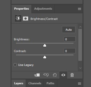
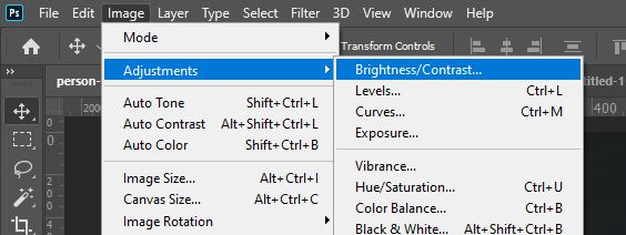
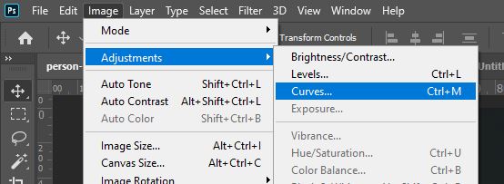
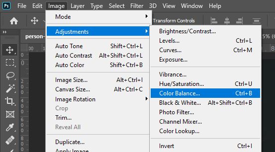
- Image – Clicking on this heading will open up a menu from which you can select options such as Adjustments, Image Size, and Canvas Size. You’ll tend to use it for making adjustments such as altering the Brightness and Contrast of an image or a layer.
- Layer – Under this heading are options to perform actions in relation to layers- for instance, adding a layer mask, creating a new layer, or merging the selected layers.
- Type – Here, you can find commands related to type (text), such as converting a type layer to a shape layer, rasterizing type, or warping text.
- Select – This menu is where you’ll find options that relate to selections, such as inverting a selection (Inverse), modifying a selection (Modify) and saving a selection (Save Selection). You can also deselect something (get rid of a selection) by choosing Deselect from the menu under this heading.
- Filter – Located under this heading are options that allow you to open Photoshop’s Filter Gallery in which you can apply a variety of automatic filters, to apply a blur effect to layers, to open the Camera Raw Filter Window, to Liquify a layer, and more.
- 3D – This menu is home to commands related to Photoshop’s 3D Workspace, such as Render 3D Layer, Merge 3D Layers, and New Mesh From Layer.
- View – Here, you can find commands that allow you to zoom in, zoom out, fit the document so that it fills the screen (Fit Screen), show or hide rulers, and add guides.
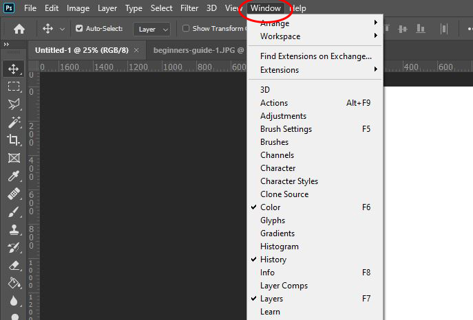
- Window – Under this heading, you can control the windows that are displayed on your screen, by choosing to open or close ones such as the Layers Window, the History Window, the Channels Window, the Character Window, and the Brushes Window. You can read more about Photoshop windows in the section below.
- Help – You can refer to this window if you’re having any issues with Photoshop. Here, you can access a help forum, video tutorials, and information on the basics of the program.
Understanding Photoshop’s Windows
As you just read about in the description of the Menu Bar, you can open a variety of windows, adding them into your workspace, by clicking on the word ‘Window’ from the bar along the top of the screen, then clicking on the name of the window that you want to open from the list.
Everything is listed alphabetically, making it easier for you to find the one you’re looking for. But there are so many options that it can be overwhelming if you don’t yet understand what a window is and what each one is for.
So, let’s start with the basics. What is a window?
Well, a window is pretty much a dedicated ‘box’ in which there are settings and options that are specific to a certain tool, topic, or function. For instance, in the Brushes Window, you’ll find options that allow you to set certain characteristics for your brushes. Similarly, in the Layers Window, you can find options related to layers and a list of the layers that are in your document.
Some windows will be open automatically, such as the Layers Window, whilst you will have to open others manually via the method that we mentioned at the start of this section.
With that established, let’s take a look at what each window is dedicated to:
- 3D – In this window, you will find functions that allow you to create 3D objects from presets, such as a sphere, cube, or plane, generate a shape using the current image as a depth map, and other options related to the 3D Workspace.
- Actions – In this window, you can control everything to do with actions, such as recording an action or carrying one out. Actions are really handy if you need to carry out a repeated process to your document. For instance, if you need to duplicate an object, then move it to the left multiple times, it would take you a long time to repeat the process a hundred times. But by creating an action, you can repeat the process quickly with the click of a button.
- Adjustments – In the Adjustments Window, you can quickly apply any adjustment to a layer, with each type represented by an icon. Having this window open will make it a lot quicker for you if you have to apply lots of adjustments, as you won’t have to keep going up to the top menu and selecting the right option from the Adjustments.
- Brush – In this window, you can control the settings of your brush to determine the appearance of the marks that it makes. By altering the settings under headings such as Shape Dynamics, Scattering and Texture, you have the opportunity to fine-tune and customize your brushes.
- Brush Presets – Here, you are able to view a list of your brushes, each of which has a sample, or preview, next to it. You can also manage your brush presets by adding new brushes, saving brushes to folders, resetting brushes, or replacing them.
- Channels – If you’re new to Photoshop, the concept of channels might be something you haven’t come across before. Channels are grayscale images used for storing the color information within images or for creating and storing masks. If you have an RGB image open in Photoshop, then a channel for each color (red, green and blue) will automatically be created, along with another one which can be used for editing the image. The Channels Window contains a list of all the channels within the image, each with a thumbnail next to it, which you can select and edit. For more information on channels, check out this article by Adobe that covers channel basics.
- Character – This window is the one in which you can control the settings of the text in your document. Here, you have options that allow you to do the basics: choose a font, a size, and a color. But there are also settings that let you choose values for the spacing, edit the width and height of each letter, and choose styles such as bold, italic, or all-caps.
- Character Styles – In this window, you can create formats that determine the styles and attributes of characters. Later on, you can also apply these styles to single characters, words, or even entire paragraphs by selecting the text and then clicking on the relevant style in this window.
- Clone Source – This panel is useful when working with the Clone Stamp Tool, allowing you to define a maximum of five sampling sources (rather than just one) and edit the sample by rotating or scaling it.
- Color – This window displays the details of the foreground and background colors that are currently selected, showing the color values and allowing you to edit them using sliders and a color spectrum.
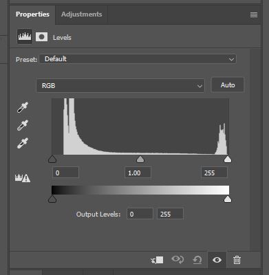
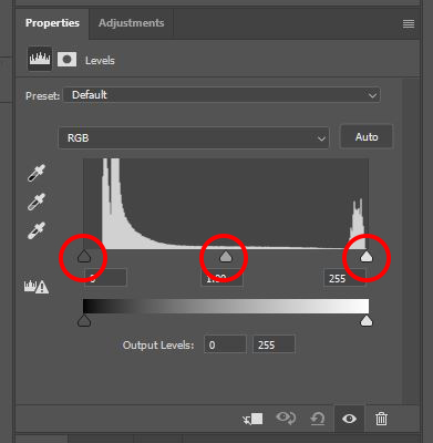
- Histogram – Within this window is a graphical display of the tonal range of an image. It graphs the number of pixels that are at each of the 256 brightness levels, from pure black (0) to pure white (255).
- History – In this window, you can view a list of the previous edits you have made to a document, and can click on any of these steps to return back to a previous state, effectively undoing multiple edits with one click. By default, Photoshop will remember the last twenty states of your document, but you can increase this value to a maximum of 1,000 states in the Performance Preferences dialog box (which can be opened by choosing Edit > Preferences > Performance). Note that with a greater number of states memorized, more storage is taken up.
- Info – This window can display lots of different pieces of information depending on which tool you’re using. It will always display file information, and will always tell you about the values of the color over which your cursor is hovering. You can read more about the Info Panel here, on Adobe’s help site.
- Layer Comps – Within this window, you can make, edit and view different versions of a layout in a single document. It’s often used by designers who want to create multiple versions of a page layout, changing up the composition of each one. Check out this page on Adobe’s help site to find out more about layer comps.
- Layers – In this window, which is, by default, located at the bottom right of your screen, you can see a list of the layers within your document. The one at the top of the list will be at the top of the layers as they appear in your design. In the same window, you can also change the blend modes, opacities, and styles of individual layers, toggle the invisibility of layers, create new layers, and merge existing ones.
- Measurement Log – This is where the measurement data is stored after you measure an object. Upon measuring a new object, a new row will appear in the window, with columns representing the individual data points within a set of measurements. Within this window, you can delete rows or columns, reorder columns, sort data, or export data. To find out more about using the measurement log, you might find it useful to check out this page on Adobe’s help site.
- Navigator – Here, you can navigate your document. The window allows for easy zooming and scrolling, and it’s a great way to view your image up close whilst managing to keep your current tool active (since you don’t have to select the Zoom Tool instead).
- Notes – Within this window, you can add text notes to a file. This can be really useful, especially if you’re working with others on a project, as you can leave messages to communicate your ideas and collaborate effectively.
- Paragraph – This window contains all the options you’ll need in order to format your text in the style of a paragraph, such as alignment and paragraph spacing.
- Paragraph Styles – In this window, you can create and save a specific paragraph style, then apply that format to other paragraphs. It’s very useful for maintaining an element of consistency throughout the paragraphs in your work.
- Paths – Here, you can create, name and save paths. The window displays a list of the names of each saved path, along with thumbnails.
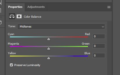
- Properties – By default, this panel will display the controls and settings for a particular adjustment when the relevant adjustment layer is made active, allowing you to edit the properties of it. It tends to be open by default, but if it isn’t already active it can be opened by double-clicking on an adjustment layer.
- Styles – This is where Photoshop lets you store layer styles and apply these to the current layer. A layer style is a combination of two or more layer effects that act on a layer to form a collaborative effect.
- Swatches – The Swatches Window is where you can store a selection of colors that you use often, and where you can find a variety of automated color schemes to use as inspiration for your projects. Swatching colors is great for situations in which you want to create consistency throughout a project, and you can save time by avoiding having to type in the same color values each time you select a color.
- Timeline – Photoshop’s Timeline is used when carrying out animation-based projects. It’s where most of the animation process takes place, allowing you to create either video or frame animations, import and edit frames, set frame rates and more.
- Tool Presets – Tool presets allow you to save your favorite tool settings, such as brush styles, text effects, and fill properties. The presets that you create are all stored within the Tool Presets Panel. To find out more about tool presets, have a read through this article.
Using Guides and Grids with Photoshop
Guides and grids are elements of Photoshop that can make it easier to work on the layout of your documents. They’re really useful when simply lining up elements or when producing more complex compositions.
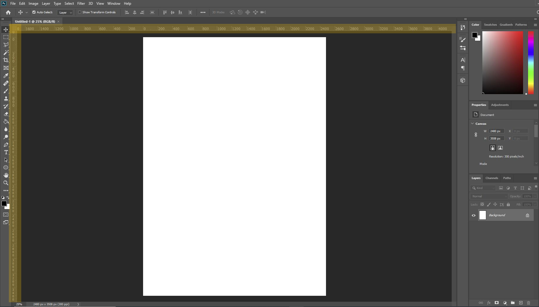
An aspect of Photoshop’s workspace that comes hand in hand with guides is rulers. These are digital rulers that appear across the top of the workspace (beneath the top options bar) and down the left side of the workspace (next to the toolbar), as highlighted with yellow in the screenshot below.
If the rulers aren’t already there, you can show them by choosing View > Rulers from the Menu Bar at the top of the screen. Note that you can also do this to hide the rulers if you don’t need them anymore.
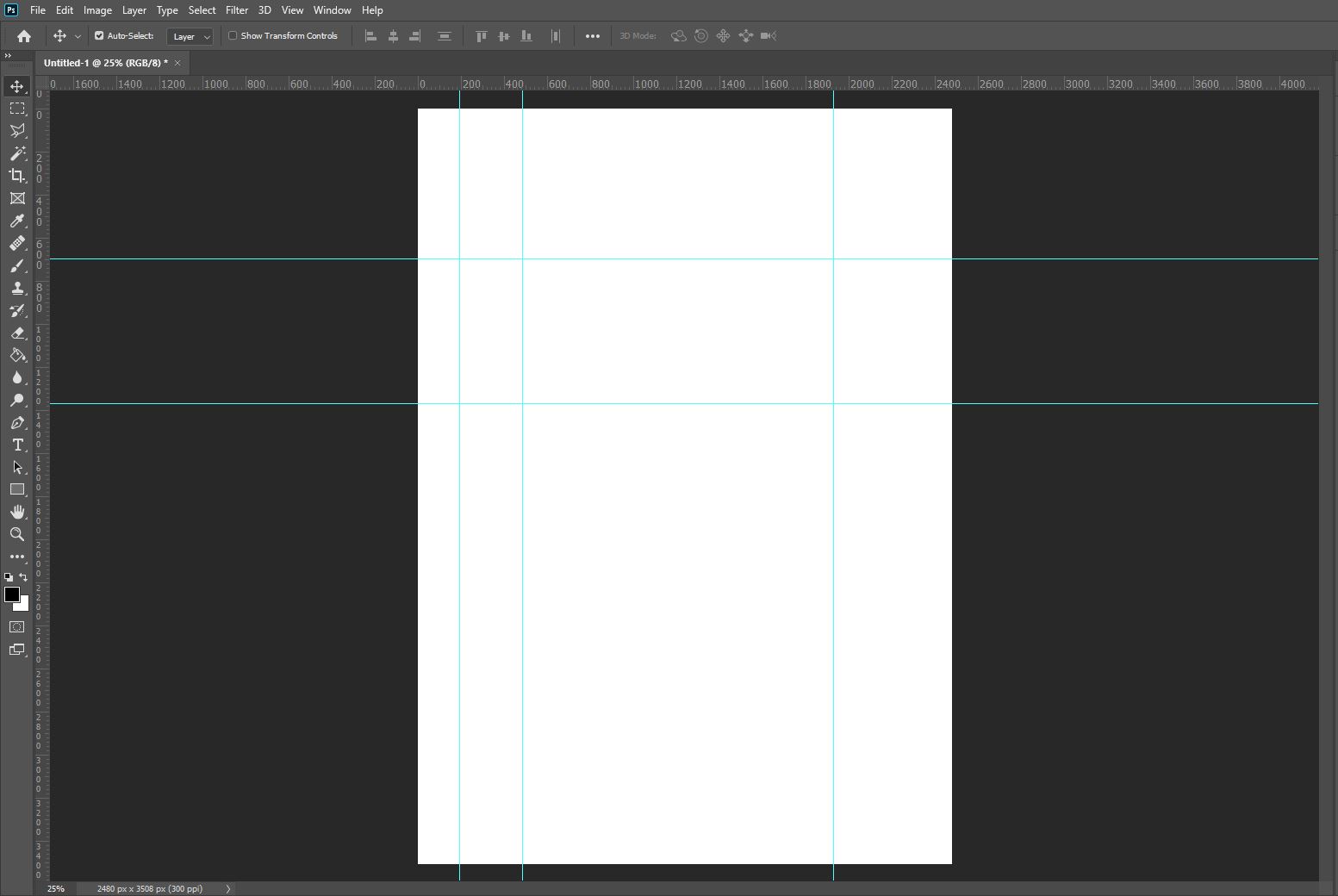
So, with the rulers open, let’s discuss how you can use them in conjunction with guides. Guides are single lines that you can add to any position within a document.
They can be either horizontal or vertical. They help to align visual elements and attract objects or tools that are dragged to within 8 pixels of them as if they are ‘magnetic’’.
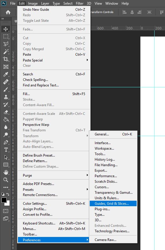
By default, they appear as solid bright blue lines, but you can change the style of them by selecting Edit > Preferences > Guides, Grids and Slices then choosing a color from the dropdown menu.
To add a guide, all you have to do is click on a ruler then drag your cursor into the document, releasing the mouse when the guide sits over the position in which you want it to be.
To create a new horizontal guide, click and drag down from the horizontal ruler, and to create a vertical guide, click and drag to the right from the vertical ruler.
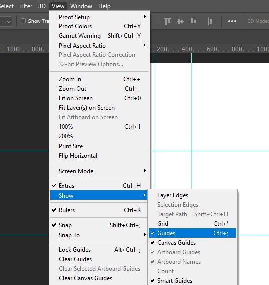
You can show or hide guides by selecting View > Show > Guides from the bar along the top of the screen, or by hitting Ctrl + ; [Win] / Cmd + ; [Mac] on your keyboard.
You can move guides using the Move Tool, which can be selected from the top of the toolbar.
To learn more about guides and rulers in Photoshop, then feel free to check out our article on using rulers and grids.
If instead, you want to use grids to help you create better compositions, then you might find it useful to take a look at our article on creating a rule of thirds grid in Photoshop to discover how to form one of the most commonly used grids amongst designers and visual artists.
Importing and Exporting files in Photoshop
Opening an Image or an Existing Document
Before you can start working in Photoshop, you’ll, of course, need to know how to open an image or existing document. Luckily, it couldn’t be easier!
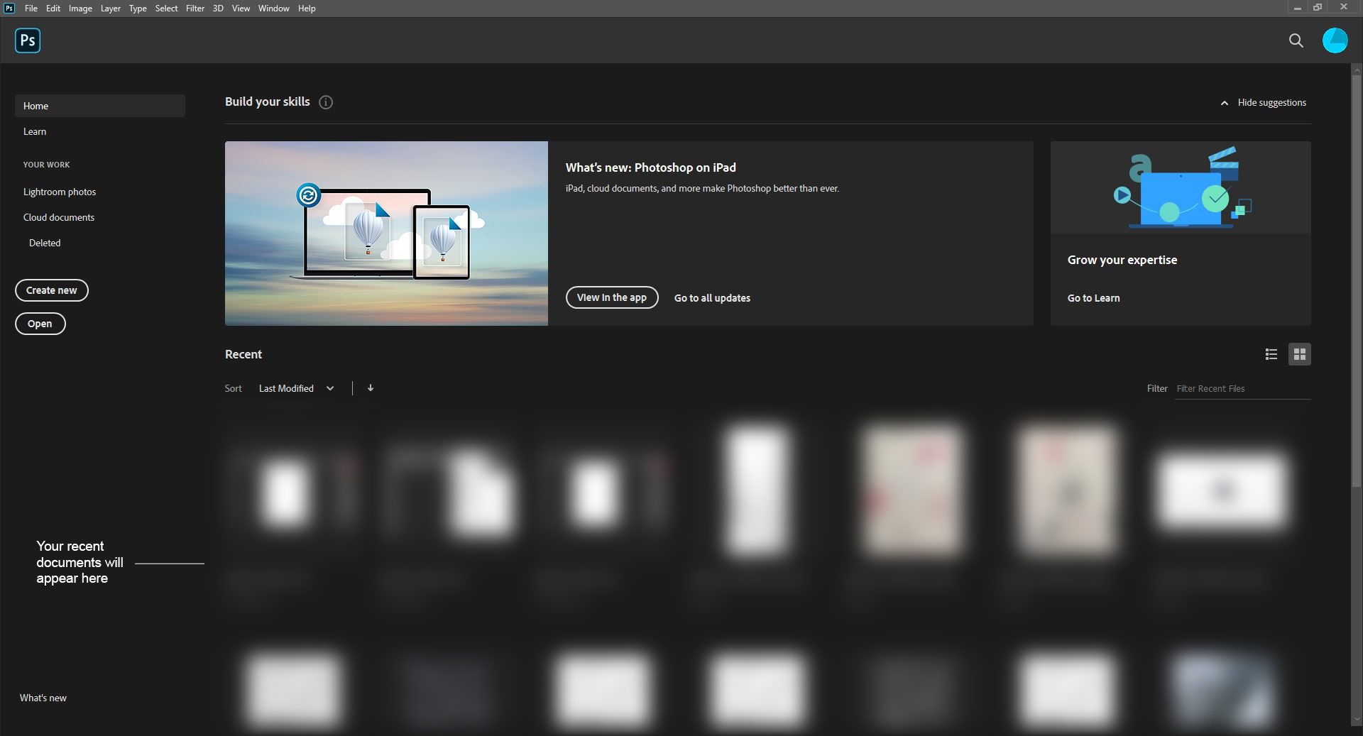
Let’s begin by opening Photoshop. Once the program has loaded, you should be taken to a home page that looks something like this:
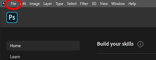
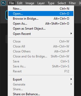
If you take a look at the top of the screen, you’ll see the menu bar that, as we mentioned earlier, forms part of the default workspace. Now turn your attention to the top left corner of the screen, where you’ll see the word File.
If you click on this word, a list will open. This represents all the actions you can carry out under the File menu. From the list, click on Open.
You will next be taken to your files, where you can locate the image or document that you want to open, then click OK to open it.
Hopefully, you’ll then notice that your image or document has been successfully opened in Photoshop, ready for you to start working on!
Creating a New Document
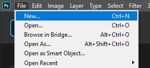
If you don’t have an image or existing document that you want to work with and would rather start from scratch, then you can create a new document just as easily. Of course, we’ll begin by opening Photoshop.
Once the program has loaded, go ahead and choose File from the top left corner of the screen. This time choose New from the list that pops up.
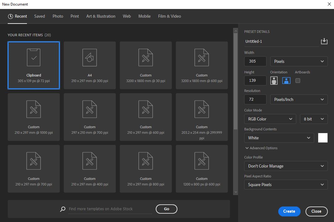
You will see that choosing this option causes a window to open, called the New Document Window. Along the top of it are options that allow you to refine the dimension options that are offered.
For instance, clicking on the first option, Recent, will generate a selection of document options based on your recently opened documents.
The Print option is useful for when you need to create a document for printing on a particular size of paper, such as A4 or A3. You’ll see that there are also options for Web, Mobile, and Film & Video that allow you to choose specific preset constraints.
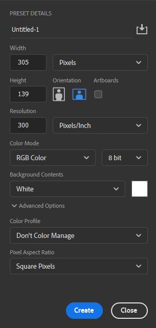
At the right of the window, there are settings that allow you to customize the properties of your document. Let’s just take a closer look at these.
- Width & Height – These settings allow you to set the dimensions of your document, with the dropdown menu next to the options allowing you to choose the units of these values (such as pixels, centimeters, or inches).
- Orientation – Here, you can choose whether your document will be portrait or landscape. Portrait means that the width will be shorter than the height, whilst landscape means that the height will be shorter than the width.
- Artboards – This option effectively allows you to have multiple canvases in one document, which can be useful when producing various versions of a design for a client.
- Resolution – The value in this box represents the quality of your document. The higher the number, the better the quality. The dropdown menu next to the option allows you to choose a unit of measurement. If your unit is pixels/inch, for instance, and your resolution is 300, this means that your document will contain 300 pixels in every inch. To read more about resolution, refer to Adobe’s page on image size and resolution.
- Color Mode – From this dropdown menu, you can choose one of the multiple color modes, such as RGB, CMYK and Grayscale. Generally, RGB is used for documents that will be ultimately viewed on-screen, whilst CMYK is more suited to documents that will be printed physically, such as business cards, flyers, or merchandise. For more information on color modes, take a look at some of the information in this article of ours.
- Background Contents – This section allows you to set a color for your document. This color will act as the background of your document and is set to white by default. You can change it to be black, any color, or transparent (meaning that your document will have no background at all).
Once you have chosen all the settings for the document and you’re happy with everything, go ahead and click ‘Create’ at the bottom right of the window.
You should see that a new, empty document has been created, ready for you to start working in!
Exporting and File Formats
So, now that we’ve covered how to create and open files, let’s take a look at how to save and export them once you’ve finished making edits.
To save a file, all you have to do is head along the top of the screen to File > Save As.
Choosing this will open the Save As Window, where you can set the document’s name, type, and file location. Find the location of your choice, then type in a relevant file name.
One thing you may be struggling with, though, is what file format to save your work as. There are so many different options that at first can seem foreign and confusing. But no need to worry, we’re going to explore the main ones now.
- PSD: Standing for ‘Photoshop Document’, PSD files preserve all the Photoshop features, such as layers and masks. It’s probably the most popular file format amongst Photoshop users and is particularly useful for saving a project that you want to come back to and make changes to later. It supports files of up to 2GB in size and doesn’t save a flattened image.
- PSB: This file format is practically the same as the PSD format but must be used if your Photoshop file is greater than 2GB. (Note that the TIFF format can also be used for files over 2GB but has a limit of 4GB, so if you exceed this limit, PSB should be your go-to option). The PSB format supports documents of up to 300,000 pixels in each dimension, allowing you to save extremely large files without any problems.
- JPEG: The most common file type used when saving flattened images, this format will save your document as a single image rather than preserving Photoshop data such as layers and masks. It supports RGB, CMYK and Grayscale color modes, so it is very versatile in that way but doesn’t preserve transparency.
- PDF: This format is described as a cross-platform format, famous for its versatility and flexibility. They preserve fonts, vectors, images and most objects within your Photoshop document.
- PNG: The defining feature of this format is its ability to fully preserve transparency in both grayscale and RGB images. It’s mainly used in instances where, for example, you’re saving a document that contains a graphic on top of a transparent background. This can be very useful for saving logos, since with a transparent background, your logo can be quickly added to other documents of all colors.
- TIFF: Mainly used for exchanging files between various computer programs, the TIFF format is one that is known for its remarkable versatility. It is currently compatible with the vast majority of image-editing and page-layout applications. It can also act as a replacement of the PSD format if your document exceeds the 2GB PSD limit, since TIFF files can support documents of up to 4GB.
For a more in-depth exploration of file formats, head over to this page by Adobe that gives helpful advice on choosing a file format. We also have an article of our own that you might find useful, comparing the TIFF and PSB formats.
For information on exporting images, check out our article on exporting images for Facebook, Instagram and your website.
Photoshop Tools and Must Know Techniques
Photoshop’s Toolbar Explained: What Does Each Icon Represent?
Do you remember the toolbar that we mentioned when discussing the default workspace? It can be found down the left side of the screen, as a vertical column showing icons representing various tools.
This is the space that Photoshop has dedicated to tools, all of which allow you to carry out various tasks, such as cropping, drawing, and making selections. Each tool can be selected by clicking on its icon or using keyboard shortcuts (these will be detailed in the final section of the article).
Sometimes, there will be multiple tools ‘hidden’ under one icon. In this case, you can double click on the ‘main’ icon to bring up a list of all the tools underneath it, then select the one you require.
So, let’s take a look at what tool each icon represents, starting from the top.
- Move Tool – This tool allows you to move objects (and other elements like guides) by clicking on them and dragging your mouse.
- (Grouped under the icon) Artboard Tool – Used to create artboards to define different areas of the canvas. These can be useful for displaying multiple compositions of one design in a single document.
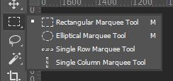
- Rectangular Marquee Tool – Used for making simple rectangular selections. You can use it whilst holding down the Shift key to create square-shaped selections.
- (Grouped under the icon) Elliptical Marquee Tool – This tool allows you to make selections in the shapes of ovals. If it’s used whilst holding the Shift key on your keyboard, you can make a selection in the shape of a perfect circle.
- (Grouped under the icon) Single Row Marquee Tool – Useful when slightly trimming the edges from an image, this tool is used for making selections with the height of just one pixel.
- (Grouped under the icon) Single Column Marquee Tool – Again, useful when trimming the edges of an image, the tool gives you the ability to make selections of any height that are a single pixel wide.
- Lasso Tool – This is probably the least complex selection tool, both to understand and to use. You simply click and drag to create the perimeter of the selection. It can be quite hard to control, so it’s probably best to only use it for more informal selections that don’t need to have perfectly smooth well-executed edges.
- (Grouped under the icon) Polygonal Lasso Tool – Seen as another one of Photoshop’s more basic selection tools, this tool lets you freely create selections by drawing perimeters composed of straight edges, effectively forming polygonal shapes. It can, therefore, be good for selecting buildings that are composed of straight lines.
- (Grouped under the icon) Magnetic Lasso Tool – This tool also involves drawing a freehand selection, but there is an element of digital control in that Photoshop detects the edges of the object it thinks you’re trying to select and automatically creates anchor points along those edges as you click and drag the tool around- as if the edges are magnetic. It can be really effective, especially if your image has a high level of contrast and there’s a clear distinction between the object being selected and the background.
- Magic Wand Tool – This tool is used for selecting single colors. With the tool active, simply click anywhere within an image, and Photoshop will automatically select all the pixels within that given color range. It’s definitely an efficient way of selecting objects that are sat in front of a plain background, such as an empty white one, or a plain wall.
- (Grouped under the icon) Quick Selection Tool – This selection tool lets you click and drag over the area that you want to select, automatically clipping to similar tones and stopping the selection upon detecting what it perceives to be edges.
- (Grouped under the icon) Object Selection Tool – Introduced in 2019, this tool lets you make a rough selection of the general area containing an object. It then automatically makes a precise selection of the object it identifies within this region, speeding up the selection process drastically.
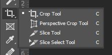
- Crop Tool – This tool is used for cropping images. In other words, it lets you delete areas from the top, bottom and sides of images. It only allows you to crop the image into a rectangular shape.
- (Grouped under the icon) Perspective Crop Tool – The Perspective Crop Tool effectively lets you both crop and change the perspective of an image in a single action. You can select a rectangular area of an image from a different perspective, and Photoshop gets rid of the areas around the selection and changes the perspective to be straight-on as if the image of the cropped area was taken from directly opposite the object depicted.
- (Grouped under the icon) Slice Tool – This tool is used when separating a document into slices, allowing you to create multiple images from a single image or layered document.
- (Grouped under the icon) Slice Selection Tool – Whilst the Slice Tool allows you to create slices, the Slice Selection Tool lets you select, move and resize existing slices by clicking on them to select them.
- Frame Tool – Great for beginners, this tool allows you to mask images by placing them into shapes, and it couldn’t be easier to use!
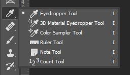
- Eyedropper Tool – Used for selecting colors by clicking on the color you would like to sample whilst the tool is active
- (Grouped under the icon) 3D Material Eyedropper Tool – Similar to the eyedropper tool but for materials. It can be used to click on the texture of a 3d object and automatically load that sample to be used as the material on another object.
- (Grouped under the icon) Color Sampler Tool – This tool can be used to click on a certain color within a document and let Photoshop automatically display the color values within that area.
- (Grouped under the icon) Ruler Tool – Photoshop’s Ruler Tool is used for measuring the distances and angles within an image or document. It can be useful if you need to crop your image to a specific size or measure the distance between two objects.
- (Grouped under the icon) Note Tool – You can use this tool to add textual notes to a Photoshop document. This feature can come in handy when you’re working on a collaborative project and want to share or explain your ideas with the other designers working on the document with you.
- (Grouped under the icon) Count Tool – One of the more obscure tools, the Count Tool can be used to count the number of a certain object present in an image. By clicking on the image with the count tool a certain number of times (one click for each object) you can let Photoshop keep count of the number of clicks and hence the number of objects.
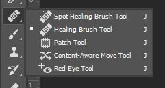
- Spot Healing Brush Tool – This tool automatically selects a sample area from around the target area that you click on in order to get rid of any blemishes or imperfections that you click on.
- (Grouped under the icon) Healing Brush Tool – This tool works by cloning particular areas that you define within an image. You can choose a custom sample area, then click a target area where Photoshop will automatically blend the sampled pixels with the pixels surrounding the target area.
- (Grouped under the icon) Patch Tool – Another tool that can be used to remove imperfections, the Patch Tool tends to be favored over the previous two tools when replacing larger areas of an image. You can choose an area to use as the sample pixels by drawing around it as if you’re using the lasso tool, then dragging the selection to the target area.
- (Grouped under the icon) Content-Aware Move Tool – This tool lets you move selected areas of an image to another image, or another area of the same image. It analyses the outline of the selected area and the pixels within the area you want to move it to in order to seamlessly blend the pixels between the newly-moved content and the background that it has been moved to.
- (Grouped under the icon) Red Eye Tool – Designed in response to the ‘red eye’ issue in low-light portraits captured using a flash, this tool automatically removes the redness in eyes, neutralizing the color and producing a convincing outcome in just one click!
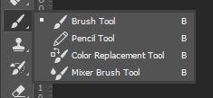
- Brush Tool – The Brush Tool works just like a paintbrush in that it paints the currently-selected foreground color onto a document. You can choose from a selection of default brushes, or download your own, with settings available to customize your brush. This tool is useful when it comes to working with layer masks.
- (Grouped under the icon) Pencil Tool – Similar to the Brush Tool, the Pencil Tool is used to paint with the current foreground color. The only difference is that the Pencil Tool can’t produce soft, fuzzy edges like the Brush Tool The lines it produces are always harsh, distinct, and clear throughout.
- (Grouped under the icon) Color Replacement Tool – This tool allows for a quick and simple color replacement process, letting you replace the original color within an image with the foreground color.
- (Grouped under the icon) Mixer Brush Tool – This tool lets you produce more realistic digital paintings in Photoshop, allowing you to mix colors together as you paint and quickly sample colors from the image that you’re painting over.
- Clone Stamp Tool – Letting you copy one area of an image onto another area, the process of using this tool involves choosing a sampling point, from which the pixels will be copied to a target area that you select.
- (Grouped under the icon) Pattern Stamp Tool – Useful when producing designs containing patterns, this tool can let you generate intriguing textures and produce your own patterns.
- History Brush Tool – This tool gives you the ability to bring back certain areas of your image to appear how they were in an earlier stage of your document’s history by ‘painting’ them back.
- (Grouped under the icon) Art History Brush Tool – A more stylistic version of the History Brush Tool, the Art History Brush Tool lets you bring certain areas of an image back to a previous state, this time using stylistic strokes, resulting in a more creative and artistic outcome.
- Eraser Tool – By using this tool to brush across an image, you can make the areas that you brush over transparent, deleting pixels and replacing them with transparency. This tool works like a black brush does on a layer mask but is a destructive version of that technique since you cannot retrieve the pixels later on once they’ve been deleted.
- (Grouped under the icon) Background Eraser Tool – Working in the same way as the Eraser Tool, the Background Eraser Tool deletes pixels by making them transparent. The only difference is that, with this tool, Photoshop tries to automatically detect the background, and then only deletes pixels that belong to this background. This means that the pixels it believes to belong to the foreground aren’t affected or deleted.
- (Grouped under the icon) Magic Eraser Tool – This tool works in the same way as the Magic Wand Tool in that you simply click on the background to identify it, but the tools differ in that the Magic Eraser Tool deletes the pixels in this background rather than selecting them.
- Paint Bucket Tool – You can use this tool to click anywhere within an object to fill it with the currently selected foreground color. It can be used to fill entire layers, shapes, selections and other closed objects.
- (Grouped under the icon) Gradient Tool – By clicking and dragging across your document with this tool active, you can quickly create a gradient that follows the direction and angle of the mouse’s motion, filling the length by which you move the mouse. The longer the drag is, the smoother the gradient will be as the colors within it are blended across a larger number of pixels.
- (Grouped under the icon) 3D Material Drop Tool – Used when working with 3D objects, this tool is used for sampling material from one area then copying it to another area of the same model.
- Blur Tool – This tool lets you paint over areas by clicking and dragging across them with your mouse. The areas that you drag the mouse over are then made to appear blurred as Photoshop decreases the contrast between the affected pixels.
- (Grouped under the icon) Sharpen Tool – As the opposite of the Blur Tool, the Sharpen Tool increases the contrast between nearby pixels that you brush over by clicking and dragging with your mouse. This gives the illusion that the image has been sharpened in those areas.
- (Grouped under the icon) Smudge Tool – This tool can be used if you want to blend the content within a particular area of your image. It works by sampling the color of the pixels in the area that you first click on and then ‘pushing’ this color in the direction in which you drag.
- Dodge Tool – This tool is used to lighten specific areas of an image. You can brush over the areas that you want to be affected by clicking and dragging with your mouse. There are also settings that allow you to place constraints on the effect so that it is only applied to the highlights, mid-tones, or shadows of an image, although it produces the best outcomes when used to brighten only the highlights.
- (Grouped under the icon) Burn Tool – As the opposite to the Dodge Tool, the Burn Tool lets you darken specific areas of an image. Used in conjunction with the Dodge Tool, it can be great at skin-retouching and is most suited to darkening only the shadows within an image. It is used by brushing over the areas of the image that you want to be affected using your mouse to click and drag across the document.
- (Grouped under the icon) Sponge Tool – Although this is one of the less popular tools, it can be great for editing images, giving you the ability to saturate or desaturate particular areas of an image, essentially removing or intensifying the color.
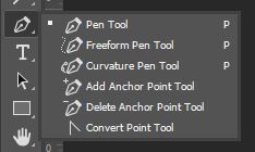
- Pen Tool – This tool is used to create either shapes or paths that can form selections or objects. It always creates a vector path, allowing for high-quality shapes to be created. Using the tool involves clicking at certain points to create anchor points that are joined together to form either a path or a closed shape.
- (Grouped under the icon) Freeform Pen Tool – Often described as a mixture of the Lasso Tool and the Pen Tool, this tool lets you click and drag around the area that you want to select, allowing you to easily draw vector paths and shapes.
- (Grouped under the icon) Curvature Pen Tool – This tool is practically a simplified version of the standard Pen Tool, making it more suitable for beginners. It allows for the drawing of more complex paths or shapes without having to worry about the often difficult editing of anchor points. The tool is great for creating smooth curves and straight lines.
- (Grouped under the icon) Add Anchor Point Tool – You can use this tool after selecting the path that you want to modify to add an anchor point to it by simply clicking the point at which you would like to add one. Anchor points can be used to control the direction of each section of the curved path.
- (Grouped under the icon) Delete Anchor Point Tool – With this tool selected, you can click on an existing anchor point on any path to delete it. Remember that anchor points are points through which you can control the direction of the curved path.
- (Grouped under the icon) Convert Point Tool – This tool allows you to edit existing anchor points on the paths or shapes within your document, letting you convert them from smooth points to corner anchor points. It’s a great way to completely change the nature and appearance of a shape.
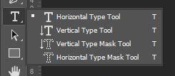
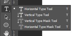
- Horizontal Type Tool – This is the standard tool for adding text to a document in Photoshop. As you type the text, it appears horizontally- the standard format for the appearance of pieces of text.
- (Grouped under the icon) Vertical Type Tool – As implied by the name, as you type with this tool, the text appears vertically, with each new letter appearing below the previous one.
- (Grouped under the icon) Vertical Type Mask Tool – This tool can be used to make selections in the shape of type, with the text used to create the mask appearing vertically, in a column.
- (Grouped under the icon) Horizontal Type Mask Tool – Like the last tool we mentioned, this tool lets you mask the shapes of letters out of a background, but in this case, the text used to create the mask appears horizontally.
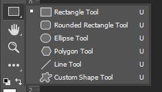
- Rectangle Tool – This tool can be used to create rectangular shapes by clicking anywhere to create a corner at that point, then dragging out to create the rest of the shape. When used whilst holding the Shift key on your keyboard, it lets you draw a perfect square.
- (Grouped under the icon) Rounded Rectangle Tool – When used in the same way as the Rectangle Tool, this tool lets you create either squares or rectangles with rounded corners instead of sharp ones.
- (Grouped under the icon) Ellipse Tool – This shape tool is used to create either oval shapes or circles (whilst holding the Shift key) by clicking and dragging outwards.
- (Grouped under the icon) Polygon Tool – This tool can be used to create polygons with different numbers of sides. To increase or decrease the number of sides in the shape, you can use the ‘]’ and ‘[‘ keys on your keyboard, respectively.
- (Grouped under the icon) Line Tool – You can use this tool to create a straight line by clicking anywhere within your document, then holding down the mouse whilst dragging it to form a line.
- (Grouped under the icon) Custom Shape Tool – This tool gives you the opportunity to draw more complex shapes. You can choose from a selection of default shapes such as arrows, lightbulbs, ticks, and lightning bolts, then click and drag to add them to your canvas.
- Hand Tool – This tool lets you navigate across a document and is particularly useful in situations where you are zoomed in and cannot see the entire canvas at once. It can be selected quickly by holding down the Spacebar key on your keyboard then clicking and dragging across the screen to move your view around.
- (Grouped under the icon) Rotate View Tool – This tool lets you rotate your canvas in order to see your work from a different angle. It’s often used to avoid having to edit at awkward angles.
- Zoom Tool – Photoshop’s Zoom Tool lets you zoom in or out to see your document closer up or from further away. It helps you to see detail within an image and to get a closer look at the edits you’re making, meaning that it can allow you to make more specific, detailed edits to small areas of your documents.
- Edit Toolbar – You can click on this icon to bring up settings that allow you to customize your toolbar.
- Set Default Colors – Clicking on the small icon (showing two black and white boxes) to the left of and above the larger colored boxes lets you set the foreground and background colors to their default states- black and white, respectively.
- Switch Foreground / Background Color – Clicking on the icon depicting the arrows (to the right of and above the larger colored boxes) causes Photoshop to swap the foreground and background colors. For instance, if the colors were originally green as the foreground and white as the background, the new foreground color will be white and the new background color will be green.
- Set Foreground Color – You can double-click on the top square of the two that sits slightly above the other one to open a color palette from which you can then select a new foreground color.
- Set Background Color – The bottom of the two colored squares shows the background color that is currently selected. You can double-click on it to bring up a color palette that you can select a new background color from.
- Edit in Quick Mask Mode – By clicking on this icon, you can switch your workspace to Quick Mask Mode, allowing you to create and edit selections quickly. For more information on quick masks, take a look at this page by Adobe.
- Standard Screen Mode – Clicking on this icon takes you to the default screen mode, displaying the image on a dark gray background, and restoring the layout to how it looked when you first opened Photoshop.
- Full Screen Mode with Menu Bar – In this screen mode, only the current document is visible in addition to the options bar and the menu bar. You can click on this icon to switch to the full screen mode and maximize the document window whilst keeping the menu bar visible.
- Full Screen Mode – Clicking on the icon representing this screen mode lets you view the document alone, with all other aspects of the default Photoshop workspace hidden, including the menu bar.
Dodging and Burning
Often used in portrait retouching, the process of dodging and burning is one that allows you to selectively and independently enhance areas of shadow and highlights within an image.
Although there are multiple ways in which you can do this, we’re going to discuss the one that is most suitable for beginners. What’s great about this method is that it’s non-destructive since all the editing is done on separate layers, preserving the original pixel data of your image. You can take a closer look at the process here- in this video by PHLEARN.
Once your image is open in Photoshop (this can be done by choosing File > Open) we’ll begin by selecting Layer > New Adjustment Layer > Curves to create a curves adjustment layer.
When dodging and burning, remember that ‘dodging’ refers to brightening areas of an image (usually intensifying the highlights) and ‘burning’ refers to making areas of an image (usually the shadows) darker.
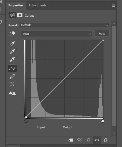
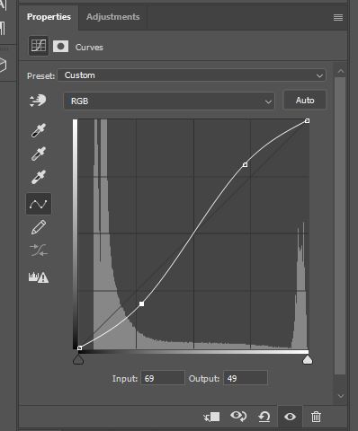
So, on our first curves adjustment layer, we’ll focus on dodging- brightening areas of the image. Go ahead and make a new point on the diagonal line in the Properties Window about a quarter of the way along, and drag this up to brighten the highlights.
At this point, the adjustment layer will be affecting the entire image. To change this, we can edit the layer mask so that only particular areas are brightened by the layer. Click on the layer mask of the adjustment layer in the Layers Window (shown by the white rectangle next to the layer’s thumbnail). Then, we’re going to hit Ctrl [Win] / Cmd [Mac] + I to invert the mask, making it fully black and therefore hiding the effect of the adjustment completely.
Then we can just select the Brush Tool (B) and use a white brush to paint back areas that we want to be brightened, such as the highlights of the image.
When you’re happy with the mask, we can make the effect look more realistic by choosing Image > Apply Image from the Menu Bar at the top of the screen. Use the default settings in the window that appears, making sure that Invert is not checked.
Then, we’re going to carry out the same process, but this time using a curves adjustment layer that darkens the image. You can do this by creating a point about three-quarters of the way along the line and dragging it downwards. Do the same thing with the layer mask, but this time using a white brush to go over the areas that you want to darken (this will usually be the shadows).
Again, head to Image > Apply Image, but this time make sure that the Invert option is selected.
And that’s about all there is to it! You should now have managed to enhance the highlights and shadows within your image, hopefully producing an effect that looks as natural and realistic as possible.
If you want to change the extent to which the highlights and shadows are enhanced (essentially making the effects of the dodging and burning more or less intense), then you can simply go back into the respective curves adjustment layers and move the control points on the curves either up or down.
Split Frequency
Frequency separation is a method of skin retouching that tends to produce realistic outcomes, managing to preserve some of the original skin texture rather than just unconvincingly smoothening the skin.
The process involves separating areas with different types of pixel information: high frequency and low frequency.
This effectively isolates the facial texture from the tones and shadows on the face, allowing you to get rid of any inconsistency that might be present within the colors, shadows and highlights whilst protecting the original texture of the skin.
For a tutorial on how to carry out this process, head over to this article on how to create naturally smooth skin in Photoshop. Or, if you would rather watch a video explaining the process, take a look at this video by Blue Lightning TV.
Cropping an Image
Cropping photos is something that any visual artist will probably find themselves doing a lot. If you’re unfamiliar with the process, cropping involves getting rid of the outer sections of images, such as the sides, top or bottom, to remove unwanted content.
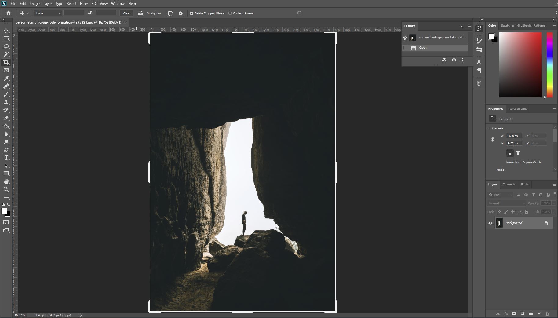
Thankfully, cropping an image, like this one by Mateusz Sałaciak from Pexels, couldn’t be easier to do. We can use Photoshop’s Crop Tool, which can be selected from the toolbar by clicking on the icon shown below.
With the tool selected, you should see that a box appears over your document, with handles at the corners, like in the screenshot below.
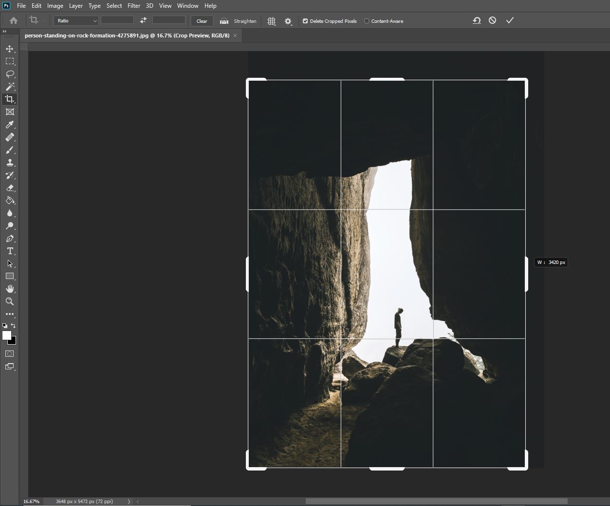
All you need to do to crop your image is click on any of these handles and drag them inward to get rid of the unwanted parts of the photo.
The sections that you get rid of will be grayed out and darkened so that you can tell which parts of the image you’re keeping.
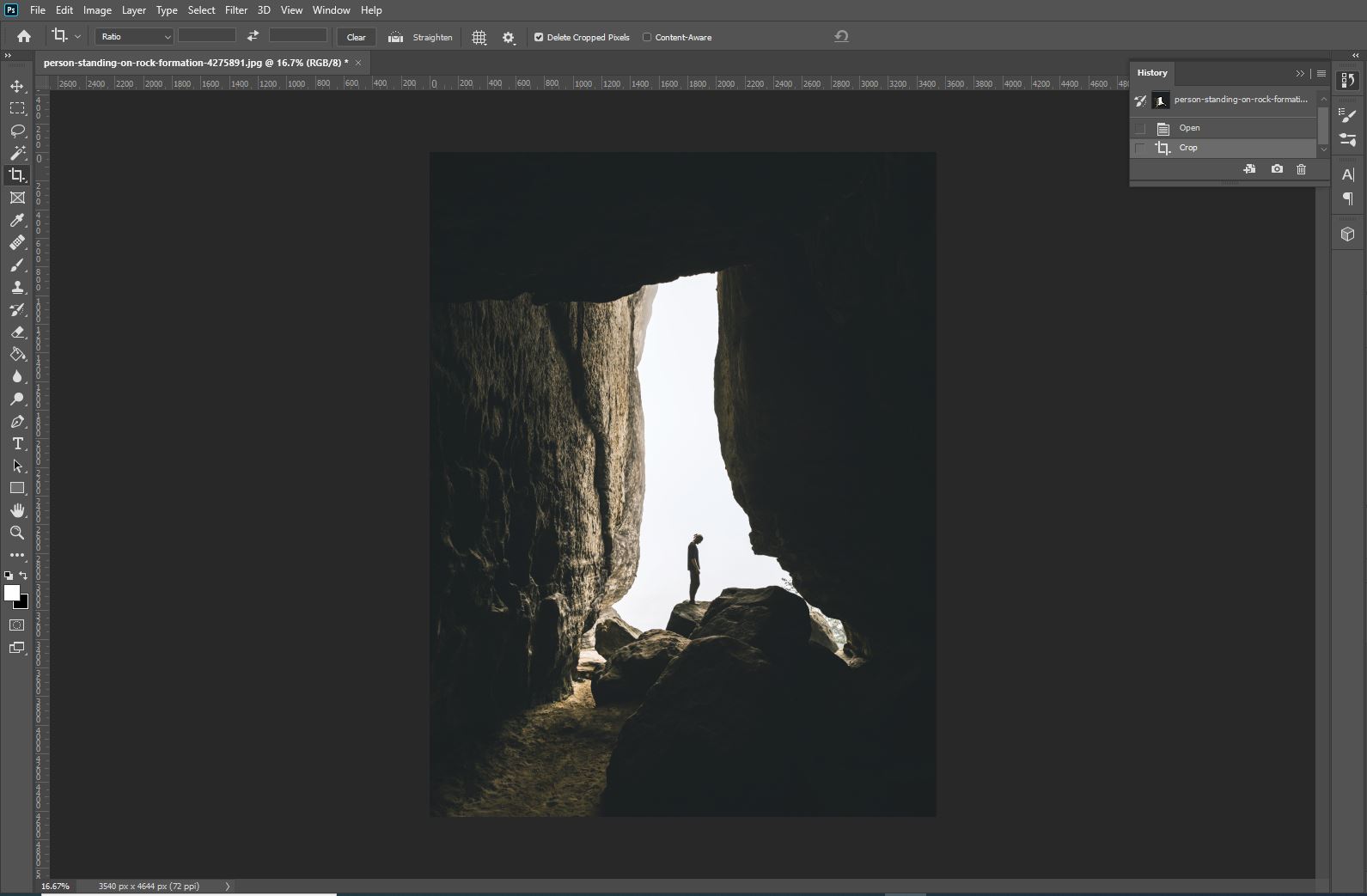
Once you’re happy with the crop, you can just go ahead and hit the Enter key on your keyboard to apply the change, and you’ll see that the image has been cropped!
Using the Brush Tool
Photoshop’s Brush Tool is probably one of the tools you will use the most in Photoshop.
It can be used for illustrations, layer masks, effects, and more. One great aspect about the Brush Tool is its versatility and its ability to be customized: rather than just offering one type of brush, you can choose from hundreds of presets, download external brushes, and even customize each brush using the large number of alterable settings offered in the Options Menu.
This is really useful as you can tailor your brushes to fit your interests and achieve effects that are unique.
To use the Brush Tool, simply click on the icon shown below, located in the toolbar down the left side of the screen.
After selecting the tool, let’s draw our attention to the Options Bar near the top of the screen, below the Menu Bar.
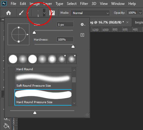
The first option in this bar, known as the Brush Preset Picker, lets you select a brush tip from a portfolio of different default brushes.
You can add your own brushes to this folder by downloading them from external sites and platforms. To learn how to do this, check out our article on how to install and use a Photoshop brush
In this window displaying the different brush tips available on your computer, there are also options to change the Size and Hardness of your brush using sliders.
To increase the size of the brush, simply click on the slider and drag it to the right, moving it in the opposite direction if you want to make the brush smaller.
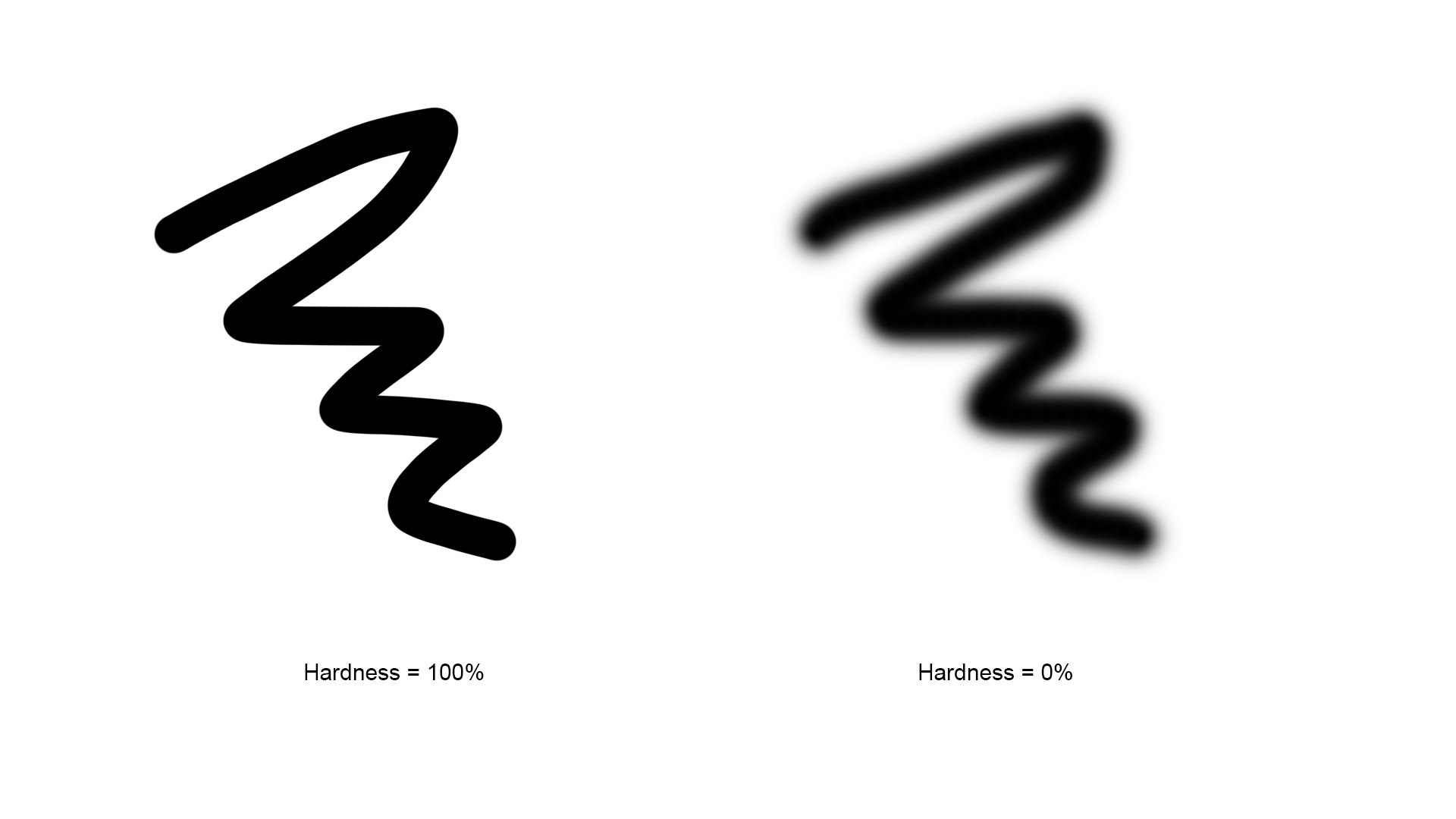
The position of the slider entitled Hardness determines how soft, or fuzzy, the brush is. A smaller hardness value (indicated by the slider being situated further to the left) results in a brush with more blurred, soft edges. This type of brush can be useful when you’re using your brush to achieve a smooth effect.
The color that is painted by the brush is the foreground color, which is shown by the color of the top square of the two near the bottom of the toolbar.
It can be changed by clicking on the box and choosing a new color from the palette that appears as a result.
Also in the Options Bar is an option to change the opacity of the brush. At 100% opacity, your brush will paint solid color that you can’t see through, whilst lower opacities allow you to see content beneath the brush.
An opacity of 0% would mean that you wouldn’t be able to see the color painted by the brush at all. You can see some examples below:
You can also change the size of your brush quickly as you work by using the square bracket keys ‘[‘ and ‘]’ to decrease or increase the size, respectively.
Those were just the more basic aspects of the brush tool, so if you want to make more advanced changes to your brushes then you can do so in the Brush Window, which can be opened by choosing Window > Brush Settings from the Menu Bar at the top of the screen.
Here, you have the opportunity to really fine-tune the appearance of your brushes, by changing the Shape Dynamics, Scattering, Texture and Color Dynamics. You can read more about how to make these advanced changes in this article.
Using the Type Tool
The Type Tool is used for adding text in Photoshop, allowing you to communicate your ideas through words rather than only visuals.
There are several variations of it, including the default standard Horizontal Type Tool and the Vertical Type Tool, which can be selected by double-clicking on the Type Tool’s icon and choosing the relevant tool from the list that appears as a result.
Upon selecting the tool from the Toolbar, you should notice that the Options Bar (near the top of the screen) becomes home to settings that you can use to customise the appearance of the text that you will type.
Let’s go through each icon in this bar and discuss what they represent.
- Toggle Text Orientation – Each time this is clicked, the orientation of the text is changed between horizontal and vertical (in other words, going straight along the page, or straight down the page, sideways).
- Set the Font Family – Clicking on this box or the arrow next to it will generate a dropdown menu from which you can select the font you want to use.
There is a selection of default fonts that will already be installed from Photoshop, so you can choose one of these or download new ones from external sites and platforms. For instructions on how to download fonts into Photoshop, check out this article of ours.
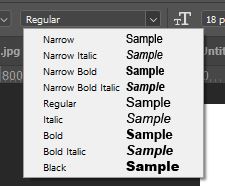
- Set the Font Style – Even if you haven’t used Photoshop before, you will probably be familiar with font formats such as bold, light, italic, and regular from your experience with word-processing applications. This dropdown menu lets you choose one of these styles to change the appearance of your text, offering previews next to each style’s title.
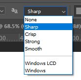
- Set the Anti-Aliasing Method – Although it sounds like a confusing word, anti-aliasing simply refers to the process by which Photoshop renders any smooth edges of your text. It involves adding pixels that are partially transparent in particular places to reduce the jagged edges of the text, essentially making an average of the pixel colors at boundaries.
If you’re struggling to figure out which setting to use, head to this article by Adobe that offers advice on the topic.
- Alignment Options – Useful when formatting paragraphs of text, or bodies of a text containing multiple lines, this option lets you choose whether to align text at the left, right or center. If you choose left, then each line of text will start at the left of the text box, the central option will cause each line of text to grow outwards from the center, and the right alignment option will start typing each new line of text at the right side of the text box. We have included some examples below:
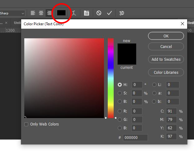
- Set Text Color – Clicking on this box brings up a color palette that you can use to set the color of your text.
If you only want to apply these changes to a section of your text rather than the entire body, then you can select areas by clicking and dragging your mouse to highlight them. To quickly select the whole body of text, you can head over to the Layers Window and double-click on the thumbnail of the text layer (the box containing a ‘T’).
A Short Guide to Selection Tools
Before we explain the process of making a selection in Photoshop, there are a few key points to know.
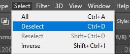
If you wish to deselect an area, you can either go up to the top menu bar and choose Select > Deselect or use the keyboard shortcut Ctrl+D [Win] / Cmd+D [Mac].
There are also options to refine your selection using the functions in the options toolbar and to soften the edges using Feathering.
- Marquee Tools – There are four types of marquee tools in photoshop: the Rectangular Marquee Tool, the Elliptical Marquee Tool, the Single Row Marquee Tool, and the Single Column Marquee Tool.
The first two tools are used to create rectangular and circular shaped selections, respectively. To use the tools, simply click on the point in the image at which you want the selection to begin, then drag your mouse to expand the selection to fill your desired area.
If you want your selection to be the exact shape of a circle or a square, just hold down the Shift key on your keyboard whilst dragging the mouse.
The final two tools can be used to select a single row or column of pixels after an area of the document is clicked and can be useful when creating borders or dividers.
The marquee tools are great for quickly selecting areas of a specific shape. However, if you wish to precisely select an area of an irregular shape, you may find another tool to be more useful.
- Lasso Tools – The Lasso Tools give you more freedom, in this respect- they allow you to select virtually any shape. The three types of lasso tool are the Standard Lasso Tool, the Polygonal Lasso Tool, and the Magnetic Lasso Tool. You can switch between these by either clicking and holding down on the Lasso Tool icon then selecting one of the other tools from the pop-up menu, or using the keyboard shortcut Shift+L.
To create a selection using the standard lasso tool, drag the cursor around the area that you wish to select. To increase the accuracy of the selection, you may wish to zoom in on your image to see where you should be selecting more clearly.
The polygonal lasso tool works in the same way but is more useful for selecting shapes with sharp, straight edges. Dragging the magnetic lasso tool, however, will quickly give you a fairly accurate selection, as it places the selection on nearby boundaries. The tool works best with higher contrast images, as these boundaries will be more distinguishable. See the adjustments section of this article to see how to increase the contrast of your image.
- Quick Selection Tool – The Quick Selection Tool is useful for selecting larger areas of a specific color or texture. Click, then drag your cursor over the part of the image you want to select. To add or remove areas of the selection, click on the corresponding icons in the Options Bar near the top of the screen.
- Magic Wand Tool – Whilst it also selects pixels based on tone and color, the magic wand tool should be used in a more precise and targeted way. To use it, click once on an area of the image that has the color you want in your selection. If you want more control over the range of color included in your selection, you can alter the Tolerance value in the Options Bar near the top of the screen. Increasing the tolerance value will increase the size of your selection by increasing the range of tones and pixels it selects, whereas decreasing it will give a more specific selection with less tonal range.
For more information about making selections in Photoshop, you might find it useful to take a look at our article that covers more complex selection techniques in the context of selecting hair.
Working with Layers
Introduction to Layers
Layers are part of what makes Photoshop so unique and popular amongst designers. They allow you to make edits to elements of documents independently, without affecting the rest of the contents.
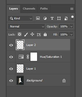
You can find a list of the layers in your document in the Layers Window, which is located at the bottom right of your screen by default.
You’ll see that the layers are listed in the format of a vertical column. The layer at the top of this column will be at the top, or front, of the document, meaning that the contents of that layer sit above the contents of the others.
By contrast, the layer at the bottom of this column will act as the background of the document, and the content of the other layers will sit on top of it.
You can see through transparent areas on layers, so the content on the layers beneath it will show through.
The order of layers can be changed by clicking on the layer you want to move in the Layers Window and dragging it to the required new position within the stack until a blue line appears, at which point you can drop it into place.
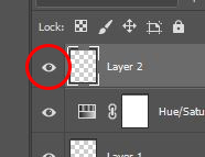
A layer can be made visible or invisible by clicking on the eye icon to the left of its thumbnail and title. Doing this means that the layer will be temporarily hidden in the document, so the contents of it won’t be able to be seen until the eye icon is clicked again.
Layer Masks
Layer masks are one of the most important things to master when learning Photoshop- you will almost definitely be using them in most, if not all, of your projects. They allow you to selectively control the transparency of different areas of a layer using black and white brushes.
Some beginners often get confused when trying to determine the difference between simply changing the opacity of a layer and adding a layer mask. Well, the difference is that the Opacity option only lets you change the transparency of the entire layer at once, whilst layer masks let you change the transparency of select parts of layers.
This means that on one single layer, you can have sections that are entirely visible, areas that are semi-transparent, and sections that are completely invisible.
So, how do you work with layer masks? To put it simply, the process of working with layer masks involves using black and white brushes to make areas invisible or bring areas back, either partially or fully.
You’ll of course need to begin by adding a layer mask to the layer that you want to control the transparency of. This can be done by clicking on the New Layer Mask icon, as shown below, at the bottom of the Layers Window. You’ll need to make sure that the right layer is active before doing this, by clicking on it (again, in the Layers Window).
After clicking on this icon, you should notice that a layer mask has been added to the active layer, as represented by a plain white rectangle next to the layer’s thumbnail. This is where you can see a preview of the layer mask as you work on it.
When working with layer masks, the color white indicates full visibility, whilst the color black indicates full transparency, making the content in areas where the layer mask is black become invisible. You can use the brush tool to add on these colors, using a soft brush for a smooth effect or a hard brush for a more distinct, harsh effect.
You can see that a layer mask initially appears white, therefore showing all the layers since white indicates full visibility. To create a layer mask that is initially black, hiding all of the content on the layer, just hold down the Alt [Win] / Option [Mac] key on your keyboard whilst clicking on the layer mask icon at the bottom of the Layers Window.
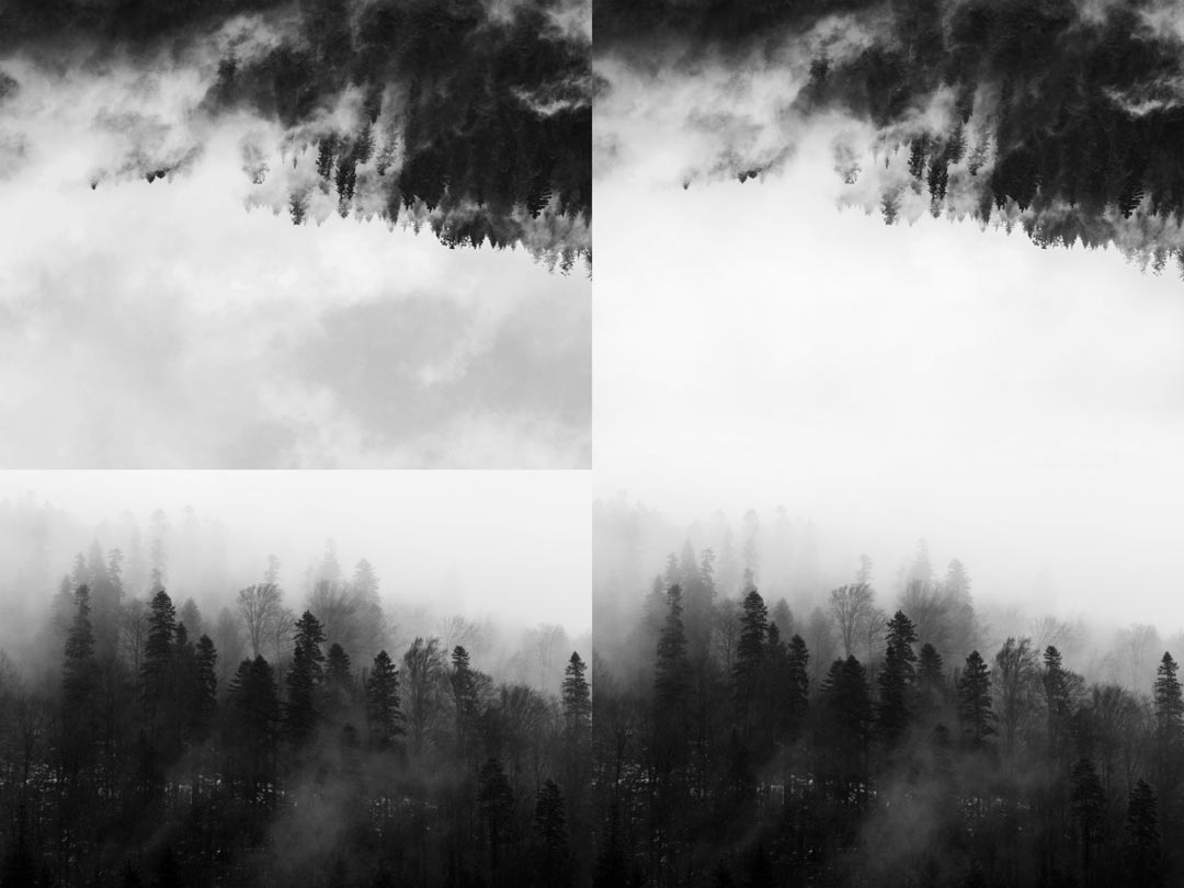
To demonstrate the effect, we brought two images (a photo by Lum3n from Pexels and a photo by Vlad Bagacian from Pexels) into the same document, rotated the top image and added a layer mask to it, and used a soft black brush to blend away the edges. You can see the outcome below. At the left is what the piece looked like before using a layer mask, and at the right is the outcome after using a layer mask to make a blended effect.
If we had realized that we’d taken the effect too far, then we could have used a white brush to bring back the content in some areas.
Another great thing about layer masks is that they allow for non-destructive editing. Unlike the Eraser Tool, which can also be used to make certain parts of layers invisible, layer masks give you the ability to bring back parts of the image that you initially made invisible.
To expand, the eraser tool fully deletes pixels to make them invisible, meaning that when you return to that document you won’t be able to bring back those deleted pixels: they’ve permanently disappeared. By contrast, when you use a black brush to make pixels invisible, it doesn’t permanently delete them, but instead temporarily hides them. You can bring them back at any point by using a white brush on the layer mask.
Note that you should always make sure that you’re using the brush to paint on the layer mask rather than over the content of the layer itself. To ensure that this is the case, double-check that the layer mask preview box is highlighted, like in the example below.
If it isn’t highlighted already, then you can make it active by simply clicking on it.
To find out about more things you can do with layer masks, check out our article on how to move and copy layer masks, giving you the ability to apply the layer mask from one layer to other layers.
Adjustment Layers and Working Non-Destructively
Adjustment layers allow you to make non-destructive color and tonal adjustments to individual layers or entire documents.
The term ‘non-destructive’ is probably one that you will come across frequently when learning how to use Photoshop. Non-destructive editing basically refers to a way of working in which you edit an image without overwriting the original image data. This means that you don’t actually make any permanent changes to the image so there’s always the opportunity to return to your image’s original state, which is great if you realize down the line that you don’t like a particular aspect of your work.
Working non-destructively often involves making edits that are applied to the image through a separate layer, which can be made or deleted independently. This brings us to adjustment layers.
Adjustment layers often play a vital part in the non-destructive workflows of Photoshop users. They’re the best way to make non-destructive image adjustments to your photos, as they make changes to factors such as the brightness, contrast, saturation and hue of the image without actually changing the tones or colors of the original pixels that its composed of.
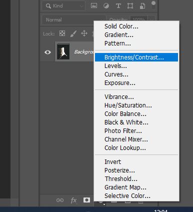
You can add an adjustment layer by clicking on the icon shown below, located at the bottom of the Layers Window. Doing so will cause a menu to pop up, from which you can choose from a variety of image adjustment options (to see a guide to what factors each of these adjustments impacts, refer to the section later on in this article, entitled ‘What Does Each Adjustment Do?’).
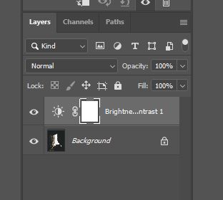
A window will also open in which you can change the values of multiple settings in order to make adjustments to the colors or tones within the document. You’ll notice that you’ve now managed to adjust the image without actually making any permanent changes to the pixels themselves!
If you only want the adjustment layer to affect the contents of one layer, then you can use a clipping mask to make the effects of the adjustment only show up on a particular layer. First, make sure that the adjustment layer is located directly above the layer that you want to be affected in the Layers Window.
If you need to move it to a new position within the stack, you can click on it and drag it to where you want to move it, until a blue line appears, indicating that you can drop it by releasing your mouse.
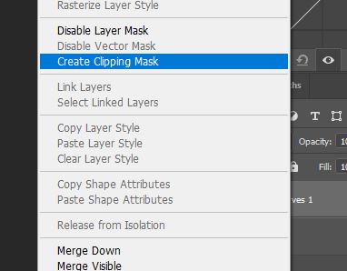
Then, right-click on the adjustment layer and select Create Clipping Mask from the list that appears as a result.
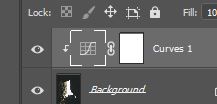
An arrow icon will then appear at the left of the adjustment layer in the Layers Window, indicating that it has been clipped to the layer beneath it, and you should hopefully see that the adjustment is only affecting that single layer.
Blend Modes
Blend modes are another unique feature of Photoshop, allowing you to change the ways in which layers blend together and the appearance of them. There are currently 27 different modes to choose from, with each one having a different effect on the style of blending.
When working with blend modes, it’s almost always just a matter of experimentation. One given blend mode will have a slightly different impact on different images, meaning that it’s practically impossible to guess what the outcome will look like. It’s therefore usually best to try out all the blend modes and see which one gives you an outcome closest to what you want.
The effect of blend modes is temporary, classifying them as non-destructive since you can always change the blend mode of a layer back to Normal. The most common ones are Multiply, Screen, Overlay, and Soft Light.
Let’s take a quick look at what effect each of the main blend modes have:
- Normal – Makes no change to the blending of the layer. You can choose this blend mode after changing it to another in order to return to the original state of the layer.
- Dissolve – Acts on only pixels that are transparent or partially transparent applies a diffusion-like pattern.
- Darken – When this blend mode is applied to a layer, Photoshop compares the brightness of interfering pixels on both the current layer and the layer beneath it. If the pixels of the current layer are darker than those on the layers below, then they remain visible, whereas if the pixels in the selected layer are lighter than those in the layers below then they disappear. This essentially means that the darker tones of all the layers remain visible.
- Multiply – As implied by the name, choosing this blend mode causes Photoshop to multiply the luminance values of the pixels in the selected layer with those of the pixels in the layers below. This is one of the best blend modes for creating shadows and removing lighter colors.
- Color Burn – This blend mode results in an outcome that is darker than that created with the Multiply blend mode, and in which the saturation of the mid-tones is increased.
- Linear Burn – Just like the Color Burn mode, this blend mode creates an outcome darker than that created with the Multiply However, it differs from the previous mode in that it results in an effect that is less saturated.
- Lighten – This blend mode results in Photoshop analyzing the brightness of the pixels that make up the selected layer and the layers beneath it. Pixels in the selected layer that are lighter than the ones in the same positions on the layers beneath, are kept visible. Photoshop then makes the pixels that are darker in the selected layer than in the layers below invisible, letting the brighter pixels beneath them show through. This blend mode is essentially the opposite of Darken, as is suggested by its name.
- Screen – This blend mode is part of the group that lightens images. It creates an outcome that is brighter and smoother than that created using the Lighten blend mode and removes more of the darker pixels.
- Overlay – Effectively combining two of the previously discussed blend modes, this mode applies the Multiply mode to darker pixels and the Screen mode to pixels that have lighter tones, whilst the midtones become transparent.
- Soft Light – As another blend mode that combines two other individual modes, Soft Light uses the Screen mode on lighter pixels and the Multiply mode on darker pixels. It works similarly to the Overlay blend mode but produces an outcome that is softer and more transparent overall.
- Hard Light – Again combining two blend modes, the Hard Light Mode applies the Linear Dodge blend mode to the lighter pixels in the layer, whilst using the Linear Burn mode on the darker ones, producing an effect that is more harsh and intense than those that may be created with other blend modes.
Since we only covered the main, most frequently used blend modes in this article, you might want to check out this article that discusses all the modes in greater detail for more information on the topic.
Opacity
Opacity, sometimes referred to as transparency, might be a concept that you have come across before. If not, then don’t worry, as it isn’t too difficult to understand.
Just like in real life, when you can have materials that are opaque (which you cannot see-through at all), semi-transparent (through which you can see objects partially, not in full detail), and transparent (through which you can see through completely), you can have layers in Photoshop that have the same properties.
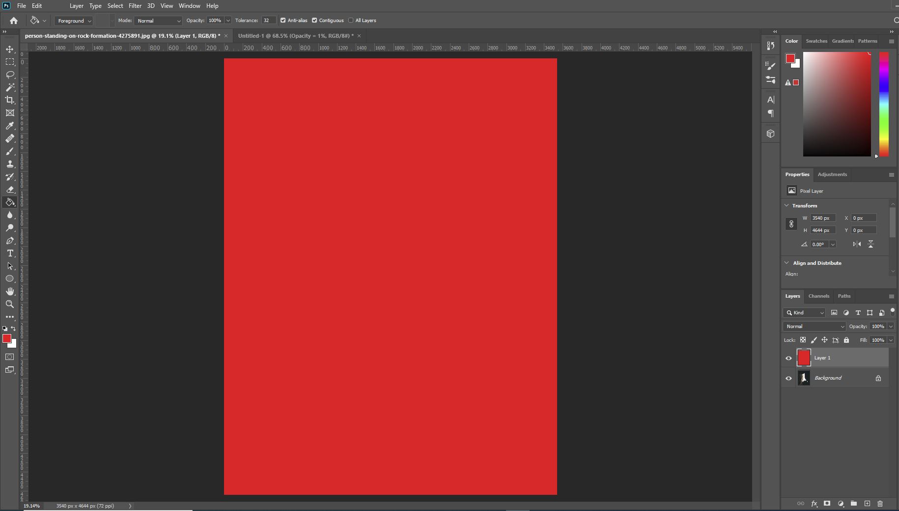
Take a red sheet of thick paper, for example. If you were to hold it up in front of you, it would completely obstruct your view- the contents behind it would be hidden. The same thing occurs in Photoshop in the instance that you add a plain red layer of 100% opacity above an image. See that a layer that has an opacity value of 100% obstructs the contents behind it.
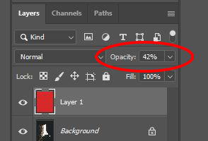
Now, let’s consider a sheet of colored cellophane- a semi-transparent material. If we were to hold up a red sheet of cellophane in front of a view, the contents that we would be viewing through the sheet would be tinted red.
If you mimic this using Photoshop, by adding a plain red layer in front of an image and decreasing the opacity of it, you get a similar result.
Finally, think about a perfect piece of completely clear glass- a material that is entirely transparent. If you were to hold this in front of you, it wouldn’t affect the appearance of the rest of the contents of your view.
The same thing will happen in Photoshop if you add a layer of 0% opacity- if the contents are completely transparent it will appear as though they don’t even exist.
The opacity of an entire individual layer can be changed within the Layers Window, using the slider that appears when you click the box shown below.
Remember to make sure that the right layer is active whilst you do this, by clicking on the layer that you want to change the opacity of before making any changes.
You can selectively change the opacity of different sections of layers using layer masks, the process of which we discussed earlier on, in the ‘Layer Masks’ section of this article.
Want to find out how to make more complex opacity changes? Take a look at our article on how to make an image transparent in Photoshop, in which we provide more in-depth coverage of the opacity basics and explore more advanced methods of changing the opacity of select areas.
Guide to Image Adjustments
Image adjustments are such an important aspect of Photoshop and digital arts in general. They allow you to completely change the atmosphere of a piece by just making a few minor changes to either the colors or tones within a document, making visual communication so much easier.
More often than not, colors and tones can be the best communicators of emotions and messages, so they should definitely receive attention during the editing process for all of your pieces. Since there are so many different options that you can use to make image adjustments, we’ve made a guide to them all to help you understand what effect each adjustment has on an image.
Before we begin, remember that you can add an image adjustment by heading to the top Menu Bar and selecting Image > Adjustments then choosing the relevant option from the menu that appears as a result.
- Brightness / Contrast – This menu lets you adjust the brightness of pixels (how light they appear) and the contrast between the tones of the pixels in the document. A higher contrast value will cause the dark tones to appear darker and the light tones to appear brighter. The values can be changed using the sliders in the window that comes up.
- Levels – Displayed in the form of a histogram, this option gives you the ability to adjust the brightness, contrast and tonal range of an image all at once by setting the positions of blacks, whites, and midtones.
- Curves – This adjustment option is often seen as the best tool for editing the tones within an image. It lets you brighten or darken pixels and increase the contrast between pixels, making it one of Photoshop’s most versatile and flexible adjustment commands.
- Exposure – In photography, exposure is a measure of how much light is present at the point at which a photo is taken. So, you can use this adjustment option to make the contents of your document lighter or darker in post-production, as if your photo was taken at a higher or lower exposure.
- Vibrance – Adjusting the Vibrance value is a smarter way of controlling the saturation levels within your image. If you increase the vibrance of an image, Photoshop will only increase the saturation (intensity) of the colors that it deems to be more muted, whilst protecting the colors that are already well-saturated. In addition, it prevents the over-saturation of skin tones, preserving their natural appearance.
- Hue / Saturation – This option allows you to adjust the actual color of pixels (by changing the hue value) and the intensity of the color of pixels (by increasing the amount of saturation). Again, you can set the values using the sliders in the window.
- Color Balance – This adjustment option lets you control the amount of certain colors that appear in an image, using sliders that increase the amount of one color and decrease the amount of another color.
- Black & White – Choosing this option will cause your document to be stripped of all its color, converting your image to grayscale. With this adjustment option, you can have more control over the ways in which individual colors are converted, unlike the lack of control you would have with a default filter. There are also presets to choose from, which are helpful if you can’t make up your mind regarding the conversion of individual colors.
- Photo Filter – This option lets you choose from a selection of filters that you can add over your image to affect the colors and tones in different ways. They’re meant to reflect the filters that can be placed over camera lenses in photography.
- Channel Mixer – This adjustment, which is commonly used for making conversions from color to grayscale, allows you to mix color channels to apply creative color effects to the contents of your documents. It can be used to produce tinted images, correct certain colors, and create unique special effects.
- Color Lookup – Applying this adjustment to your image will cause Photoshop to take the original colors within the photo and replace them with a selection of different but similar ones. You can choose from various presets, each of which will result in a slightly different outcome.
- Invert – This option allows you to invert the colors within your image to create color effects that can turn out to be really intriguing. It can be used to create strange, otherworldly images, to simply invert a negative scan into a positive one, or to change a design that was originally white-on-black into a new one that is black-on-white.
- Posterize – This adjustment option is used to apply poster-like effects to your images. You can set a number of tonal values for each channel (for example if you specify this to be three in an RGB image, your affected image will be composed of nine colors: three for red, three for green, and three for blue).
- Threshold – With this filter, you have the opportunity to convert color or grayscale images into images made up of only black and white. This results in a high-contrast, minimalistic effect, allowing you to determine which areas of the image are brightest and which are the darkest.
- Gradient Map – This adjustment tool lets you assign certain colors to certain tonal values. Each pixel is then converted into a color you specified based on its tonal value. You are able to create your own gradient, the darkest areas of which replace the shadows within your image, the midtones of which replace the pixels of an average exposure, and the brightest areas of which replace the highlights in your image.
- Selective Color – This is a really useful tool that allows you to add different hues (colors) to different areas of your image based on the brightness levels of those areas. For instance, you could add green tints to the shadows of an image and red tints to the highlights.
- Shadows / Highlights – With this tool, you can separately adjust the brightness of the shadows and highlights of an image. This means that you are able to, for instance, make the shadows (the darker areas of your image) lighter, whilst preserving the tonal values of the brighter pixels (the highlights).
- HDR Toning – This option lets you apply HDR-style effects to an image, affecting the contrast and exposure of your photos.
- Desaturate – This option completely deprives the entire image of color, without allowing you to really be in control of the effect. It’s great for if you want to quickly convert an image from full color to grayscale, but not so great if you’re looking for a tool that allows for an element of personalization. It produces an effect that is fairly low contrast.
- Match Color – This tool lets you match the colors in a source image and a target image, making it really useful for artists who create composites due to its offering of consistency.
- Replace Color – Although it can seem complicated at first, this tool lets you tap on a certain color within your document and replace it with a new one. For an explanation of how to use the tool, take a look at this page by Adobe.
- Equalize – This tool essentially turns the lightest areas of the image into white and the darkest areas of the image into black.
Brightness and Contrast
Although they are perhaps two of the easiest adjustments to understand, the brightness and contrast of an image can have a significant impact on the appearance of the outcome. If done correctly, adjusting them can take an image to the next level.
When adjusting the brightness and contrast of photos, particularly ones that you want to look authentic, it’s important to remember that sometimes all you need is a small adjustment.
Making drastic changes to the contrast, for example, can result in an outcome that looks unprofessional and overly edited (unless, of course, it is done intentionally for the purposes of creativity). So, if you want to keep things looking natural, then minor adjustments are your friends.
So, let’s take a look at how you can actually make changes to the brightness and contrast of your images and documents.
To work non-destructively, you can do it by adding a brightness and contrast adjustment layer. This can be done by clicking on the icon shown below, at the bottom of the Layers Window.
Clicking on this icon will cause a pop-up menu to appear, listing all the possible adjustment layers that you can create. From here, click on Brightness and Contrast.
You should then notice that a new adjustment layer has been created, as shown in the Layers Window. It will automatically be made active, ready for you to make changes to the values of the adjustment settings.
Upon creating a new adjustment layer, Photoshop will automatically open a Properties Window, in which you can set the values of the variables that are being adjusted (in this case, the brightness and contrast within the image).
Head over to this window and experiment with the values of the brightness and contrast by dragging the sliders to the right or left to increase or decrease the values, respectively.
A higher brightness value will make all the pixels appear lighter, whilst a lower one will make them all darker. Increasing the contrast value will make the light pixels brighter and the dark pixels darker, whilst decreasing the value will make the tones increasingly similar.
Because we’re working with adjustment layers rather than applying the edits directly to the image layer, we can easily make the effect of the adjustment layer invisible by clicking on the eye icon next to the layer’s name in the Layers Window, bringing us back to the original state of the image.
Alternatively, you can adjust the brightness and contrast of your image or document by heading along the top of the screen and selecting Image > Adjustments > Brightness and Contrast from the Menu Bar.
Then, just follow the same process that you would follow when working with an adjustment layer. The only difference is that the changes you make when working in this way will be permanently applied directly to the image layer.
This means that you won’t be able to remove the edits later on if you decide that you don’t like the effect they have. The same thing applies to all direct adjustments.
Curves and Levels
Both the curves adjustment option and the levels adjustment option are used for tonal control. They both allow for flexible altering of the brightness and contrast of a document, so due to their similarity, Photoshop users can often get confused as to what the differences are between the tools.
The main difference is that the levels adjustment option changes all the tones within an image to the same extent, whilst the curves option allows you to select which section of the tonal scale, or range, you want to adjust, and the extent to which individual portions are affected.
Let’s take a closer look at the two adjustment options, starting by diving deeper into the workings of the Levels option. This adjustment lets us make changes to three different tonal values in order to adjust the overall image tone: we can make the highlights brighter by setting a new white point, we can set a new black point to darken the shadows, and we can make the midtones in the image either lighter or darker.
In the Levels dialog box (which can be opened by choosing Image > Adjustments > Levels), you’ll notice that the tones within the image are represented by a histogram. Underneath this histogram are three sliders, which we’ve circled in the screenshot below.
These sliders act as the black point, white point, and midtone sliders, so you can move them to the left or right to edit the brightness of each tonal value within the image.
In terms of understanding the shape of the histogram, the height of the graph at each brightness level (as represented by the tone of the point along the black-to-white gradient directly below the corresponding point on the histogram) reflects the number of pixels that have a brightness value of this level.
In other words, the higher the spike at any certain point along the histogram, the more pixels there are in the image at that corresponding brightness level.
If you move the sliders that determine the tonal values of the brightness of the highlights, midtones, and shadows, then you’re effectively changing the brightness value of the pixels that fit into that section of the tonal spectrum, whilst also causing the brightness of the other pixels to change accordingly as the range is altered.
We’ll now take a closer look at the Curves adjustment option. This option also lets us make adjustments to the highlights, midtones, and shadows of an image or document, and the process involves creating and dragging points along an originally straight line to create a unique curve.
It’s particularly useful for adjusting the relationship between the tonal values within a document.
For instance, you can make the highlights brighter and darken the shadows by creating an ‘S’ shape on the curve in the window for the adjustment. The option also tends to support the creation of more dramatic effects than the Levels adjustment option, which allows for more subtle global changes, does.
Let’s go ahead and open the Curves Window, by either heading along the top of the screen to Image > Adjustments > Curves, or clicking on the New Adjustment Layer icon at the bottom of the Layers Window, then choosing Curves from the list that comes up.
The first option of the two will let you make adjustments directly to the image layer, whilst the latter allows for non-destructive editing by letting you make the adjustments on a new, separate layer.
No matter which of the two methods you use, you will see a new window open containing a straight, diagonal line.
We will use this area of the window to make adjustments to the brightness of the tones within our image by adding and moving points along the line to generate a curve.
So, now that the window is open, we can start trying to understand the format of it. Underneath the straight-line graph, you’ll notice a horizontal line filled with a black-to-white gradient. Any given point along the curve will affect the pixels of the brightness value directly beneath it along this gradient.
This means that points further to the left will affect the darker tones, and the points further to the right of the graph will affect the lighter tones.
Therefore, to make adjustments to a certain tonal value, all you need to do is create a new control point by clicking on the point of the straight line that’s directly above the corresponding tone in the gradient at the bottom.
After creating a new control point at a certain tone, you can click on it and drag it upwards to lighten the pixels of that tone, or downwards to darken them.
To create contrast using the Curves tool, add a control point to the section of the line corresponding to the highlights of the image (about three-quarters of the way across the graph) and another to the section corresponding to the shadows (about a quarter of the way across the graph).
Then, you’ll need to make the highlights brighter and the shadows darker by dragging the highlights control point (the one further to the right) upwards, and the shadows control point (further to the left) downwards.
You’ll notice that the curve resembles an ‘S’ shape of some sort. This is the general shape of a curve that increases the contrast within an image.
Color Balance
Unlike the curves and levels adjustment options, this is a tool that affects the colors of the pixels rather than the tones of them. It lets you change the overall mixture of colors within your document in order to correct colors in a more general way.
The function can be used for a wide variety of tasks, such as adding hints of color to the washed-out faces of subjects, making certain colors within a sky more intense, or making more creative color effects. Whether the outcome is natural or more supernatural, using the Color Balance option is a great way to communicate certain moods or atmospheres through the colors within your images.
You can open the Color Balance Adjustment Window by either heading along the top of the screen and choosing Image > Adjustments > Color Balance, or by clicking on the New Adjustment Layer icon at the bottom of the Layers Window then choosing Color Balance from the list that appears.
Note that the first method makes direct edits to the image layer and overwrites the original pixel data. So, if you want a method that is reversible and non-destructive, then opt for adding an adjustment layer.
You should then see that a new window opens up, containing sliders that allow you to change the amounts of particular colors within your image.
Within this panel, you’ll notice that you can select either Shadows, Highlights, or Midtones as the tonal range that will be affected by the color adjustments. This can be done using the dropdown menu at the top.
There is also an option to preserve the luminosity of the pixels whilst changing the colors, meaning that the tonal balance in the image will remain unchanged. To select this option, simply click on the checkbox entitled ‘Preserve Luminosity’.
In terms of using the sliders to actually start editing the balance of the colors within your image, all you need to do is drag each slider towards the color that you want to increase, and away from the color that you want to decrease.
Then it’s just a case of experimenting with the values by playing with the positions of the sliders until you achieve an effect that you’re happy with!
Processes For Which Photoshop is Commonly Used
Now that we’ve covered the more general aspects of Photoshop, we’re going to take a quick look at some of the ways in which you can apply your knowledge to popular editing situations.
Below are some common processes for which Photoshop tends to be used. You can find in-depth tutorials for so many other processes on the ‘Free Tutorials’ section of our website.
Skin Retouching
This process is undoubtedly one of the most common ones for which Photoshop is used. With so many opportunities and options for skin retouching, many professional photographers or graphic artists opt for Photoshop when enhancing the skin of the subject in a portrait.
This video by PiXimperfect on retouching and sculpting in Photoshop provides the perfect in-depth explanation of skin retouching techniques. To discover other ways in which you can edit the skin of a subject in Photoshop, why not take a look at our tutorial on adding freckles to a portrait.
Removing Distractions From Images
Another common process undertaken in Photoshop is that of removing distractions from images. Whether it’s a large crowd of people, a single bird, an unsightly building, or a logo on an item of clothing, it can be removed using Photoshop.
For details on the process, take a look at our article on how to remove anything from a photo in Photoshop.
Changing the Color of a Single Element of an Image
Thanks to Photoshop’s wealth of color adjustment tools, it’s possible to change the color of pretty much any object within an image.
You can follow the links below to find our articles containing details on how to change the color of specific elements, but similar processes can be applied to most objects.
Replacing the Sky in an Image
Another task for which Photoshop is commonly used is replacing the sky in an image.
It can be really annoying when you have an incredible landscape shot but the sky is ruining the atmosphere of it. But, luckily, you no longer have to worry about this issue, as you can simply replace the old sky with a new one in Photoshop!
To find out how to do so, take a look at our article on how to replace a sky in Photoshop.
Recoloring Black and White Photos
Photoshop is again a popular choice of software for those wishing to add color to a black and white image.
This process is particularly useful for adding an element of life, in the form of color, back to old photographs. We discuss the method in our article on how to colorize a black and white image.
Keyboard Shortcuts and Working Efficiently
As discussed in our article listing the 20 Photoshop keyboard shortcuts you need to know, shortcuts are a great way to make your workflow more efficient.
They take out the time wasted clicking on various tools and options and searching through menus for the tools you’re looking for, instead of letting you select them within seconds at just the click of a few buttons on your keyboard.
We’ve created a handy visual that will help you remember all the most useful keyboard shortcuts, which you could even print out and place next to your computer to refer to if you forget them.
Here are some of the main keyboard shortcuts:
- Pen Tool = P
- Lasso Tool = L
- Magic Wand Tool = W
- Brush Tool = B
- Crop Tool = C
- Clone Stamp Tool = S
- Marquee Selection Tool = M
- Eyedropper Tool = I
- Gradient Tool = G
- Zoom Tool = Z
- Hand Tool = Hold the Spacebar whilst clicking and dragging with your mouse to navigate your workspace
- Fit to Screen = Ctrl [Win] / Cmd [Mac] + 0
- Rotate Image = R then click and drag with your mouse to rotate the view of the document
- Free Transform = Ctrl [Win] / Cmd [Mac] + T (also hold down the Shift key whilst transforming to preserve the original proportions of the layer’s contents)
- Deselect = Ctrl [Win] / Cmd [Mac] + D
- Undo = Ctrl [Win] / Cmd [Mac] + Z
- Change Brush Size = Use the square brackets: ‘[‘ to decrease the brush size and ‘]’ to increase it.
To Conclude
So, that was an overview of pretty much everything you need to know about Photoshop!
You should now have a better understanding of the ideas behind each of the functions of the program, such as why and how they work and what effect they have. We hope that you’ve managed to get your head around the layout of your workspace and where you can find certain tools and options.
You have hopefully also gained an insight into the ways in which you can apply your knowledge of Photoshop and so should now be ready to embark on your creative journey, ready to become an absolute pro at using the program!
The important thing to remember, though, is that practice is key. It takes time and dedication to master Photoshop and reach your dream skill level, so don’t give up if you don’t see much improvement immediately. Keep practicing, keep being creative, and enjoy the learning process.
Hey, I'm a Professional Retoucher making $10k a month thanks to Photoshop.Register to my newsletter to get freelancing tips and a FREE Brush Pack in Bonus! My Newsletter

